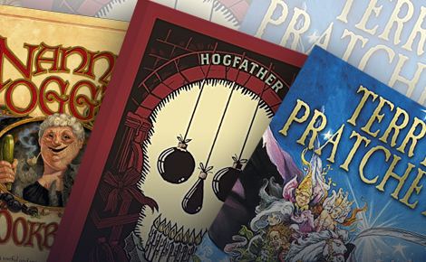
Is there any finer feeling for a bibliophile than being in the company of books? Each one of you will know the giddy thrill of picking up a new tome – the lovely warm ‘thunk’ when you tap it, running your fingers across virgin sheets of freshly printed words, flipping the pages and having a cheeky sniff when you think no one is watching. What could possibly mean more to a reading addict than a book? A Library, of course! A temple for the worship of words.
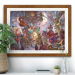
For us, the Great Library of Unseen University on the Discworld is, quite literally, the most magical literary institution of them all, containing the highest concentration of ‘bookishness’ anywhere in the multiverse! We wanted to pay artistic tribute to this astonishing establishment by devising an image to make every book-lover go weak at the knees, a view of this monumentally impossible place that would draw you in for a moment and make you want to stay forever.
“The Library certainly wasn’t silent. There was the occasional zip and sizzle of a magical discharge, and an octarine spark would flash from shelf to shelf. Chains clinked, faintly. And, of course, there was the faint rustle of thousands of pages in their leather-bound prisons.
– Terry Pratchett, Equal Rites.
Capturing Terry Pratchett’s infinite, multi-dimensional, thaumically-charged library was no mean feat. As always, we started by re-reading our extensive file of notes on the novels, piecing together all the snippets of material from which we could construct a truly fantastical image true to the books. As Discworld fanatics, you’ll all know how well Terry Pratchett described Unseen University, so we’ll skip right ahead to the design and sketching process…
Firstly, we had to decide a time and a place for the image. We might have plumped for a magical, twinkling night time scene, with starlight lancing down from the dusty glass dome high above, or we could have gone for a mind-melting maze reminiscent of MC Escher. In the end we decided we wanted a light airy view from the entrance of the library – a welcoming sight for any aspiring wizard, full of grandeur and literary possibilities with just a hint of potential for thaumic catastrophe.
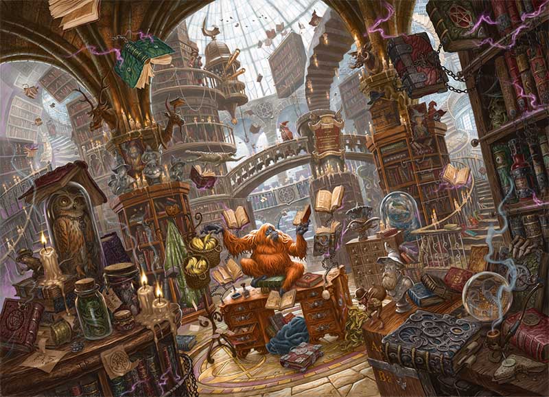
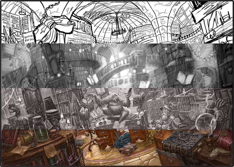
The composition of the image had a LOT of work to do. Not only did it have to look jolly nice, but it had to create the illusion of a HUGE space, draw the viewer in to explore the image, and support the twisted perspective of L-space. If the framework of a picture feels ‘real’, then the fantastical elements will be a lot more convincing and immersive. To give the viewer a sense of truly being there, the library was drawn from a head-height perspective, thus allowing the viewer to explore the library from the point of view of a bona-fide wizard! This beautifully simple viewpoint allows the beholder to look ‘up’ in wonder at the dome and down onto the floor as it stretches away beneath the feet, giving the sense of feeling the ancient flagstones, or being able reach out and grab a book from the shelves.
Imagine standing in a cathedral, with its aisles and rows of arches, columns and pointy-topped windows… the internal architecture deliberately draws your eyes to behold the impressive space before you. If such divine design is good enough for the house of god, we thought we’d nick a bit of it for fiction’s greatest library! Strong perpendicular lines, sweeping arches and columns in the mid-ground provide vertical structure for the whole image, leading the eyes upwards and suggesting the colossal mass of the building. The curves in the distant dome extenuate these leading lines to create a pleasing contrast in shape toward the center of the image, and are reflected in the bridge and flooring. To make the environment more ‘unreal’ we skewed the image for a dizzying effect and drew in multiple meandering paths into the image; stairways spiraling out of control, walkways, bridges…. all adding to the sense of indefinable space and depth. With a strong a framework of reality we could apply the fantasy and populate the piece…
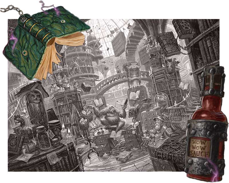
If the framework of the illustration sets the scene, then the details tell the story. We began to find homes for some of our favourite details from the novels, from Wow-Wow sauce to the Verruca Gnome, from the shopping carts that appear in Reaper Man to The Globe from the Science of Discworld series, you’ll find them all dotted around the library. A lot of Pratchett’s descriptions of the library are visual, but the sounds and smells are equally important. As we began to map out details, we made sure that there were plenty of sources to stimulate the senses in the imagination. A gently smoldering tobacco pipe, guttering candles, and a gently rotting pile of bananana skins all suggest the unique bouquet of Unseen University, while the crackle of octarine sparks, clinking of chains, rustling of pages and footsteps on flagstones gently break the academic silence. Using exaggerated textures we hoped to convey the feeling of running your fingers over leather-bound books and ancient polished wood. All of these sensory cues were designed to put you, dear reader, in the picture.
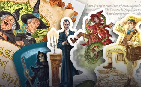
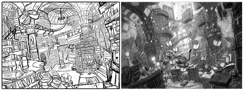
At this point we’d nailed down the design of the illustration, and yet we’d barely started. After a series of compositional drawings and draft sketches we soon realised that if we ever wished to see project completed we’d need a little help. So, we enlisted the aid of one of our associate artists, the fabulous David Wyatt, to bring the image to life. David has illustrated Pratchett covers for the Amazing Maurice, The Carpet People and Bromeliad trilogy, along with numerous Discworld calendars over the years not to mention book covers for the likes of J.R.R. Tolkien, Jasper Fforde, Philip Pullman and more recently Kieren Larwood’s The Five Realms series. David really was the only choice for the job, having worked with the Emporium for over a decade on various projects and knowing Discworld well enough to tackle such a complex image with the care and attention to detail required. Most importantly he was daft enough to say yes!
“I first visited Discworld (illustratively speaking) back in 2001 when I designed the cover of The Amazing Maurice and his Educated Rodents. At the time, Terry’s children’s books were released by a different publisher than those of the Discworld novels, although I believe Maurice was the first crossover. Immediately after that I re-covered a number of his earlier works. There followed an avalanche of commissions for assorted Discworld quiz books, calendar images, craft beer labels and even stamps (which led to a long association with the fine folks at the Discworld Emporium).
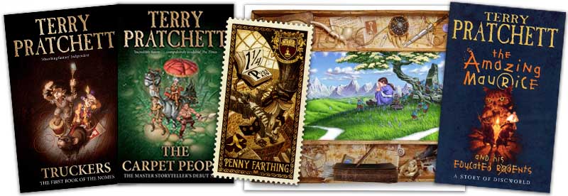
A selection of David’s Discworld book covers and artworks, including the Unseen University Library as illustrated for Discworld Stamps!
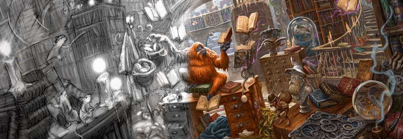
As I had painted the Librarian several times before, I knew what I was getting myself into in trying to depict his place of work. The biggest challenge was dealing with the warped architecture and creating a sense of depth whilst cramming as much detail in as possible to make the puzzle interesting. It was a little overwhelming to paint as a whole, so I concentrated on specific areas at first, moving them around until everything started to sit right. This was achieved by scanning in pencil drawings and fleshing them out in Photoshop/Painter. It’s not unusual for me to produce a tonal study of an illustration (if I get that right then the colouring is usually a piece of cake) but never one this finished; on this occasion it was important that all the little details were clear as everything needed to be approved at the highest level. It also made sense to get a feel of how the image would translate into jigsaw pieces at the printed size (I don’t do such enormous pictures normally!)” – David Wyatt.
As David worked from Ian’s sketches, the image began to come to life in the most extraordinary way. Sketched and completed in sections, piece by piece UU’s Great Library was coaxed into existence. The piece went back and forth between designer and illustrator to get the depiction ‘just right’, morphing from grey pencil, to black and then to sepia before being give a full colour treatment. The palette we chose to colour the image is full of jewel tones; emerald greens, ruby reds,golds, and bronzes and rich mahogany wood hues to reflect the sumptuous surroundings of the wizards’ world, while highlights of smoke dust and octarine sparks convey a spirit of magic and mayhem.
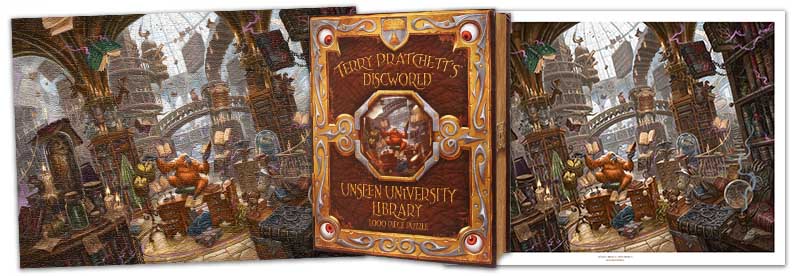
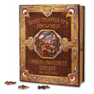
The Emporium has a tradition of creating ambitious detailed visions of the Disc, from the meticulous architectural models of Bernard Pearson’s Unreal Estate, to the cartographic wonders of the Compleat Ankh-Morpork and Discworld Atlas… if the devil is in the detail then devilish we are! We love telling stories with our depictions of Terry Pratchett’s world, and this piece is no exception being one of our most ambitious illustrative projects yet. A real labour of love, after the research and design process it took a total of twelve weeks’ work to produce the final image. Never before has the Great Library of Unseen University been seen in such detail, and we take great pride in being able to lay before you our vision of this puzzling place in Glorious Thaumicolour!
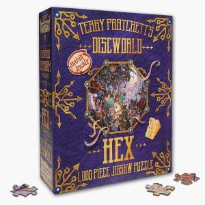
From the outset, we knew that the library in all its fantastic detail was destined to become the second of our Fiendishly Difficult Discworld Jigsaw Puzzles. A puzzle as intricate as this is an illustrator’s nightmare, because every single centimeter of your work is literally broken down into pieces and scrutinised at close range… and by rabid Pratchett fans at that! We were, of course, entirely unafraid by this challenge (largely due to it being David Wyatt’s problem now) and because we’re so proud of this piece, we thought we’d push the boat out on presentation too. If you wish to own this image in jigsaw form, you will find it arrives in a fabulous spell book box designed by Ian and David – after all, what could be a more appropriate vessel for an Unseen University Jigsaw Puzzle than a spell book?! It’s probably the only puzzle you’ll want to keep on your bookshelf, looking as it does, like a magical tome from those hallowed shelves of Unseen University. If time, inclination or attention-span preclude such puzzling activities, you’ll be relieved to know that this work of art and magic is also available as a sumptuous print produced on silk-finish archival paper to decorate your own libraries and reading rooms!
We hope you enjoy exploring Unseen University’s Great Library, the first of our elaborate scenic escapes into Terry Pratchett’s Discworld . . .