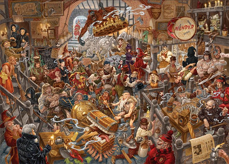
Face the long, short, furry, undead and rocky arms of the law as we forensically investigate our ‘arresting’ illustration starring Sam Vimes & Co. from Terry Pratchett’s watch series.
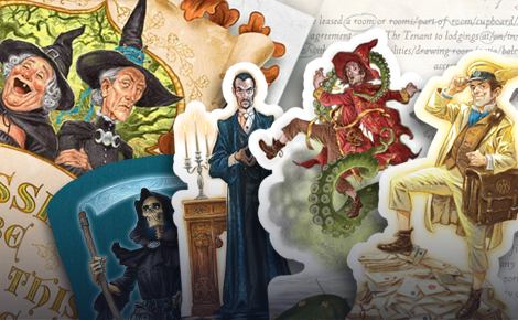
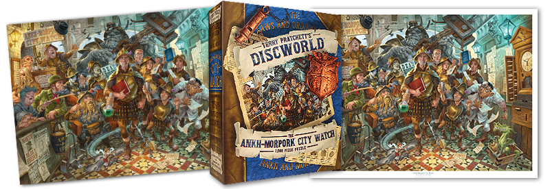
Keeping the peace can be hard in a city where, as a matter of course, thieves thieve, assassins assassinate and seamstresses… um… don’t. Thankfully His Grace, His Excellency, The Duke of Ankh; Commander Sir Samuel Vimes Blackboard Monitor and the Ankh-Morpork City Watch are here to serve and protect. In our latest puzzle and print we chose to salute the finest body of men, women, dwarfs, trolls, werewolves, golems, igors, gnomes, feegles, vampires and whatever Nobby Nobbs is, on the face of the Disc with our faithful rendition…
Here at the Emporium we’re lucky enough to welcome Discworld fans from all over the known roundworld, and we like to ask our visitors one simple question; ‘What’s your favourite book?’. Mostly we do this because we enjoy the beetling brows and pained expressions on their dear little faces; It’s truly wonderful to watch the inner struggle. You might as well ask someone to pick a favourite child, or vital organ. This careful research on the fans’ favourite Discworld title has revealed that typically, after desperately listing all 41 novels, their most beloved Pratchett ‘book’ is ‘The-guards-series…followed-closely-by-the-Death-series-oh-and-the-witches-books-but-I-do-love-the …’
If anything, this reveals that there are some things most Discworld fans love more than any one of Terry’s books, and that’s his characters. Discworld’s inhabitants often govern a reader’s fondness for particular titles over the narrative itself (although Terry’s storytelling is of course absolutely masterful in our completely biased opinion). Pratchett’s decades-long development of his protagonists has enabled us to feel a unique devotion to Discworld’s denizens that keeps us hooked on the books, with detailed descriptions that enable us to depict them in our mind’s eye and translate them to paper through the conduit of talented illustrators such as David Wyatt.
![]()
Sam Vimes’ character took 24 years’ worth of writing to fully develop. From a drunkard in the gutter to the world-renowned Duke of Ankh. A dirty fighter, hero, father, maverick, renegade, leader, reluctant noble and bacon sarnie aficionado. He’s one of the most complete and complex fictional characters in the history of the written world. As readers we’re afforded a look inside his head and out through his eyes. We see him fight a pack of werewolves barehandedly, bring peace to between nations, completely flummoxed by a disorganiser and utterly disarmed by a pair of tights and a silly hat. In short, he’s more ‘real’ to many readers then the people with which they ride the bus every day.
The Watch itself is a great reflection of Vimes’ character – flawed and imperfect, steadfast and fair. From the virtuous to the villainous, each member of the Ankh-Morpork City Watch has a deep, believable and often relatable personality. With the potency of readers’ passion for the watch in mind, we knew we had to do our utmost to honour Terry Pratchett’s vision of the Watch as faithfully as we could.
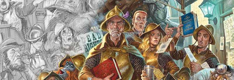
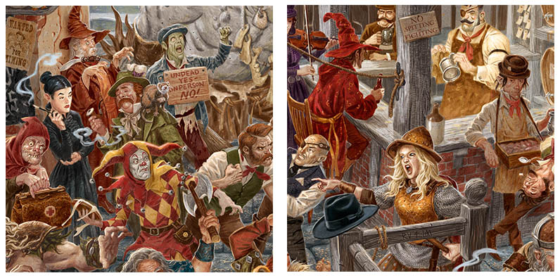
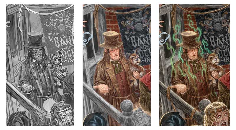
Designing our composition was relatively easy. Sam had to be the centre; surrounded by an ensemble of A-MCW’s most prominent members. Our depiction doesn’t take place at a particular time or reflect a specific scene from a city watch book, but captures all the character and anarchy of the city watch in one action-packed tableau. However, to add a hint of narrative to proceedings, we intentionally placed each City Watch officer, constable and recruit to focus the interest on Vimes, each of them vying for his attention in a suitably characteristic manner. Constable Visit tries to hand out his pamphlets, Carrot wants to address a statute from ‘The Book’ and Buggy Swires of the Airborne Division swoops past on a pigeon.
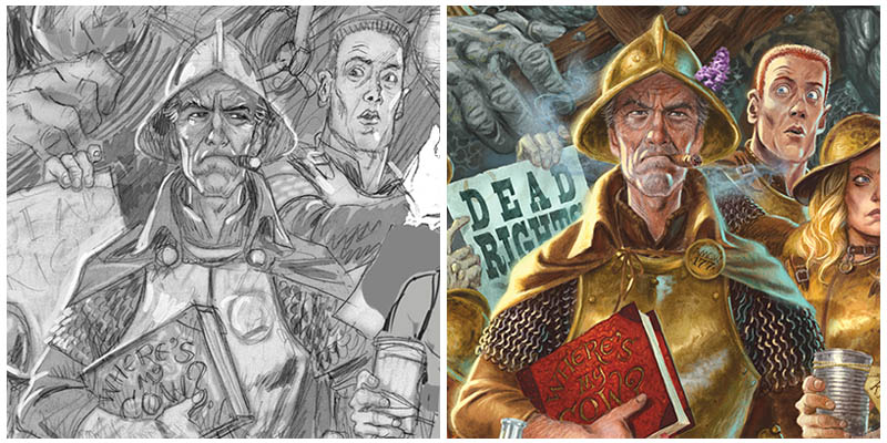
As the whole world is looking to Commander Sir Samuel Vimes for guidance he stares impassively ahead – it’s coming up to six o’clock, and he clutches a copy of ‘Where’s My Cow?’ under his arm. It’s time to get home for the most important task of the day. This understated narrative gave us chance to make the image engaging but not overshadow the characters.
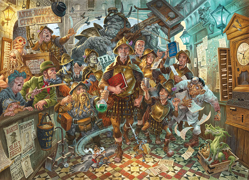
Setting the image in the City Watch Headquarters at Pseudopolis Yard (a grand former family home of Sybil Ramkin) gave us the opportunity to include so many allusions to Terry’s narrative details and to logically assemble so many watch members into the image; an entrance big enough for Detritus, and a likely lurking spot for Constable Downspout for example. We chose to use fairly ‘filmic’ colour palette and depict illumination with a blue key-light and orange fill-light to pay homage to the classic blue/orange schemes famously used in so many action films. The lighting helps to isolate Vimes as the focus of the scene, while a cool backlight adds a bit of drama and a soft forelight makes such a detailed and busy image easy for the eye to read.
Once we had our image designed, David used our extensive briefing documents to begin ‘fleshing out’ our character likenesses. Over the many years we worked with Terry to created Discworld merchandise, he was good enough to have spent considerable time helping us understand his vision for certain characters (it is no secret that Terry often described Vimes as a hybrid of Pete Postlethwaite and Clint Eastwood). From our Clarecraft models to character cards in the Discworld: Ankh-Morpork board game we’ve always endeavoured to represent Terry’s descriptions. However, David gave each of our likenesses a bit of his own flare and our line-up of unusual suspects soon came to life (or not, in Reg Shoe’s case)!
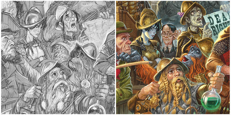
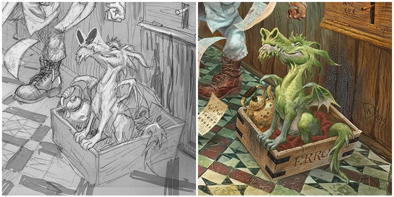
You’ll encounter Dorfl, Fred Colon, Sally von Humperdinck, A.E. Pessimal, Cheery Littlebottom, The Librarian (a special constable), Reg Shoe, Buggy Swires, Detritus, Sam Vimes, Carrot Ironfoundersson, Wee Mad Arthur, Angua, Nobby Nobbs, Constable Visit, Igor, Constable Downspout and of course, City Watch mascot Errol the swamp dragon! A group of disgruntled Morporkian citizens await Colon’s attention to the left of the scene.
With such rich source material, we could only fit so much in one image without overcrowding it. Not every watchman ever mentioned could feature, nor every detail from every book pertaining to The Watch, but there’s nothing more satisfying as a viewer than spotting new details in an image at every glance, so wherever we could we’ve included little nods that might be familiar to the Discworld enthusiast.
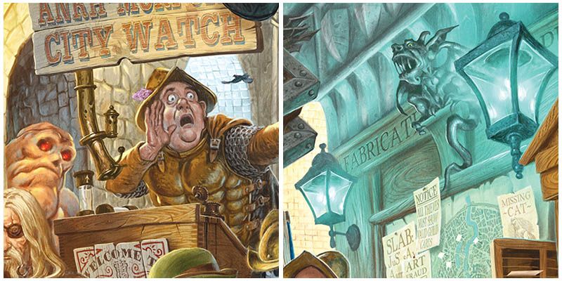
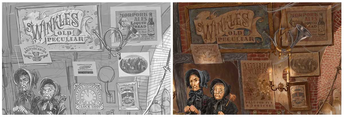
This is Pseudopolis yard, a building once owned by the Ramkin family and bequeathed by Lady Sybil, most vestiges of their occupation would have been removed, but their emblem, the green dragon, can still be seen in the floor tiles. You might spot a cartwheel clamp, from the traffic division established in Jingo, a wanted poster for the Dyslexic Alphabet Killer mentioned in Making Money or the work of a certain Mr J. Clockson. A few choice sprigs of lilac garnish the helmets of those who remember the Glorious 25th of May from Night Watch. You may also spot the odd familiar faces from this world, making an arresting appearance. As always, there’s more to Ankh-Morpork than meets the eye.
If you’d like to investigate our arresting artwork forensically, we’re very proud to offer it as both a 1,000 piece puzzle presented in our usual book-box and as a stunning art print to observe from the solitary confinement of your own cell walls.
Who watches the Watchman? You can! So kick back, relax, take down your particulars and enjoy our exclusive renditions of The Ankh-Morpork City Watch!
The new year has well and truly begun and a fresh decade has dawned. Terry’s list of Discworld year names continues to give us humorous titles to mark the passage of time, and 2020 shall henceforth been known on the Disc and to us fans as THE YEAR OF THE CONDESCENDING CARP!
As we plunge head-first without a crash helmet into ‘interesting times’ let us wistfully glance back over our shoulder at what we got up to in The Year of the Incontrovertible Skunk we get too close to the Red Star…

Of course we’ve already enjoyed one apocalypse as 2019 began with bubbling anticipation for the adaptation of Terry Pratchett and Neil Gaiman’s cult collaboration Good Omens!
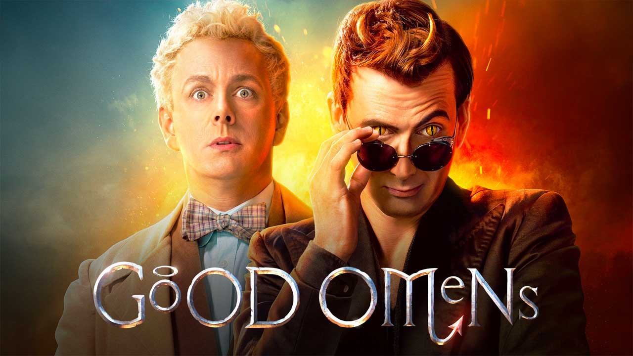
First broadcast in May on Amazon Prime, Good Omens stuck faithfully and suitably quirkily to the beloved book and was a visual extravaganza bursting with comedic screen stars including the seraphic Michael Sheen as Aziriphale and the devilishly good David Tennant as Crowley. Good Omens has now already won the Comedy.co.uk award for Best TV Comedy Drama and Best Comedy Drama of the Year 2019!
A host of divine editions of Pratchett and Gaiman’s book and spinoff publications were released to accompany the series including the official Good Omens TV Companion, the Good Omens Script Book, BBC Radio Play and TV tie-in paperbacks along with the glorious Illustrated Good Omens with artwork by Paul Kidby!

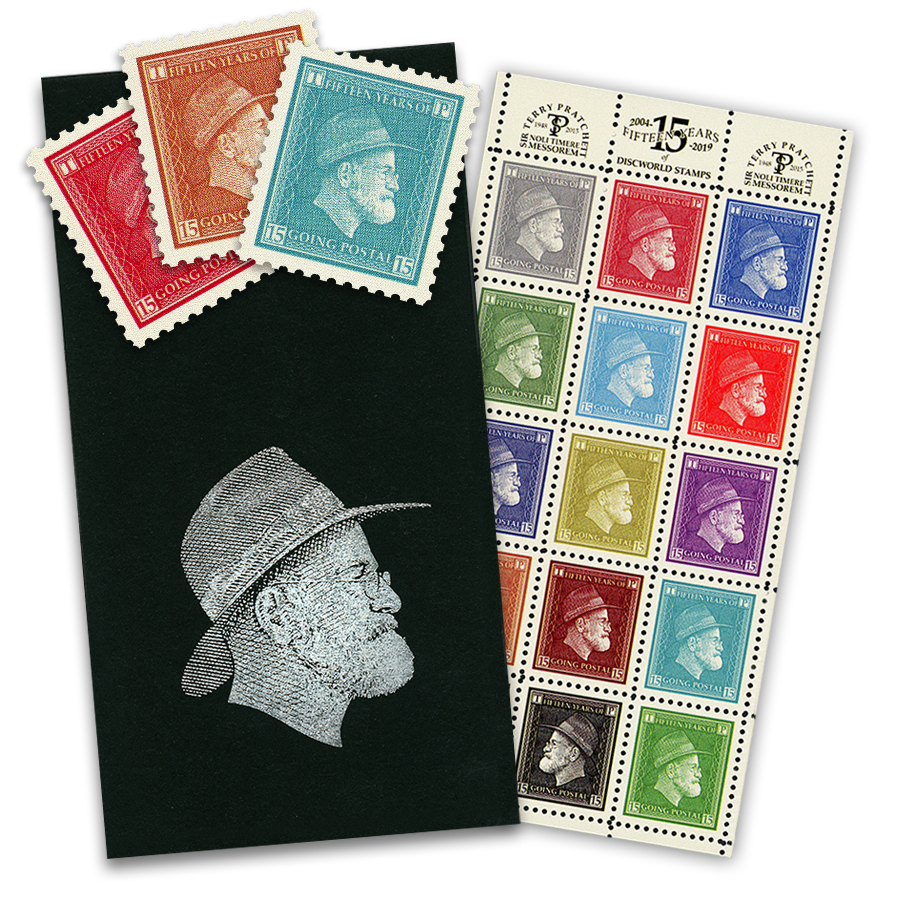
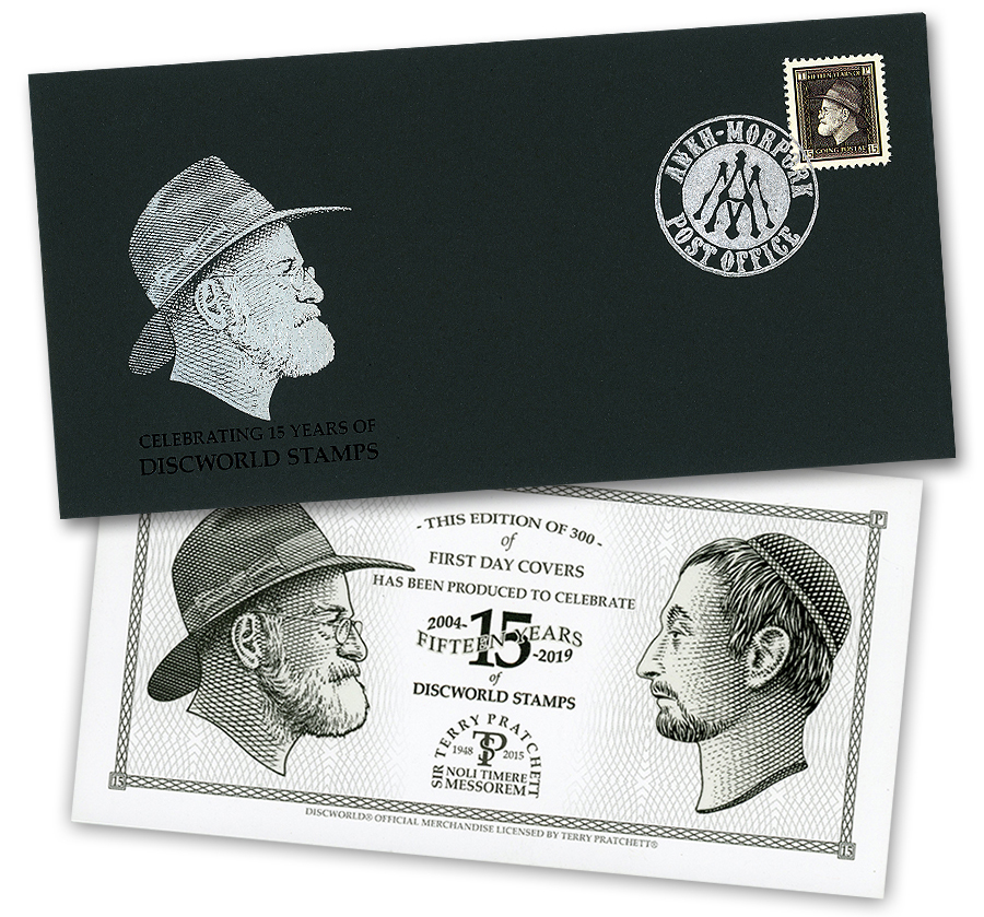
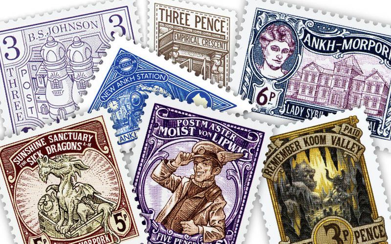
2019 was a celebratory year for Discworld Stamps, as we reached our 15th year of ‘Flately’, as Terry so named the world of Discworld Stamp collecting! Nothing seemed more fitting than putting the profile of Sir Terry Pratchett on his own Stamp, the Penny Pratchett! We commissioned master line artist Brian Delf to create Terry’s portrait for this special issue which was available in a limited edition presentation sheet and first day cover.
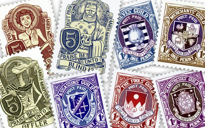
There was of course a new collection of Definitives as designed by Moist Von Lipwig in Going Postal, plus offerings featuring the sublimely ridiculous architectural creations of B.S. Johnson. The major Guilds enjoyed sponsoring a series of stamps featuring their respective coats of arms, while Discworld deities Offler, Blind Io and Anoia joined our gods collection of Discworld Stamp issues illustrated by Matthew Green.
Other Ankh-Morpork establishments represented on stamps in 2019 included the Lady Sybil Free Hospital, The Sunshine Sanctuary for Sick Dragons and the New Ankh-Station from Terry Pratchett’s Raising Steam which graced the year’s coveted Five Dollar Blue Triangle.
We couldn’t commemorate fifteen years of Discworld Stamps and Terry Pratchett’s Going Postal without celebrating the Postmaster himself, so in August Moist Von Lipwig featured on his own five pence stamp illustrated by David Wyatt!
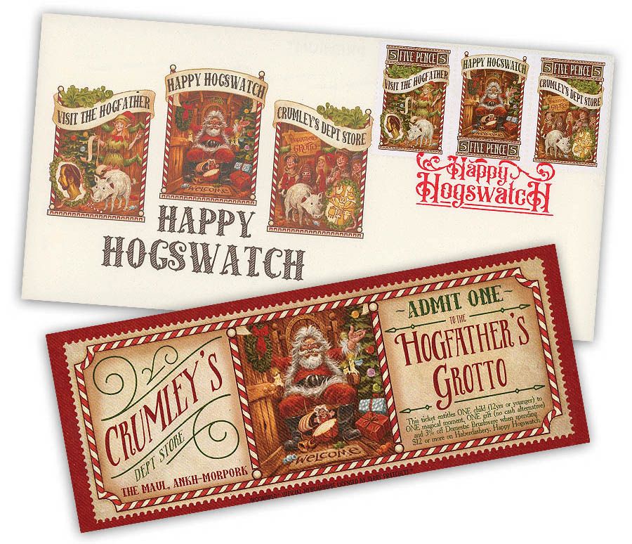
The year in stamps concluded with a traditional Hogswatch offering from the Ankh-Morpork Post Office, with a triptych of festive issues depicting the famous Grotto at Crumley’s Department Store from Terry Pratchett’s Hogfather. Each stamp featured on a beautiful whole sheet and on a first day cover complete with a sumptuously illustrated ticket entitling Collectors to sit on the Hogfather’s knee!
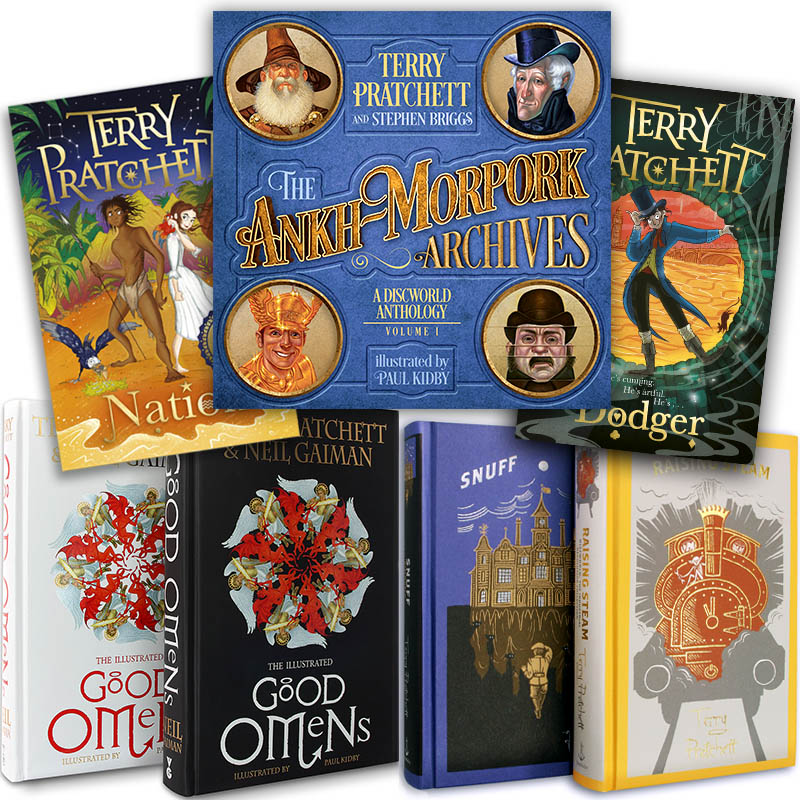
Along with a bevvy of Good Omens publications, there was a crop of new Pratchett book editions released last year including new paperbacks of Terry’s children’s books Dodger and Nation with bright and beautiful cover artwork by Amelia Fang author Laura Ellen Anderson. Snuff and Raising Steam were finally released in beautiful Discworld Collector’s Library Editions in November, thus completing the ‘adult’ series of this handsome collection of hardback Discworld books,
Discworld diaries of yore were compiled by Stephen Briggs into one beautiful hardback volume with revised, revamped and redesigned artwork by Paul Kidby to create The Ankh-Morpork Archive Volume I – a guidebook to Ankh-Morpork’s Guilds, institutions & environs as written by Stephen Briggs and Terry Pratchett in the years 1998, 2000, 2002 and 2007 respectively.
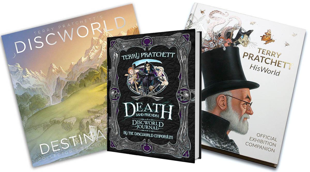
The official Discworld Diary had a change of identity in 2019 to become the Discworld Journal. Gone are the restraints of time and space in favour of a perennial jotter for your memos and musings, full of illustrations and quotes from favourite Discworld characters. The first such edition was the ‘Death and Friends’ Discworld Journal, compiled by us and illustrated by David Wyatt – ideal for jotting down your life story or ‘immortal’ prose!
The Discworld Calendar soon followed which was themed on Paul Kidby’s fantastically depicted Discworld Destinations. We also happily acquired stock of the official Terry Pratchett: Hisworld Exhibition Companion, the story of our favourite author, told through the objects and artefacts on display at the Terry Pratchett: HisWorld Exhibition in Salisbury 2017 – an everlasting exhibition for you to enjoy at home whether you were there or wanted to be!
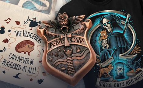
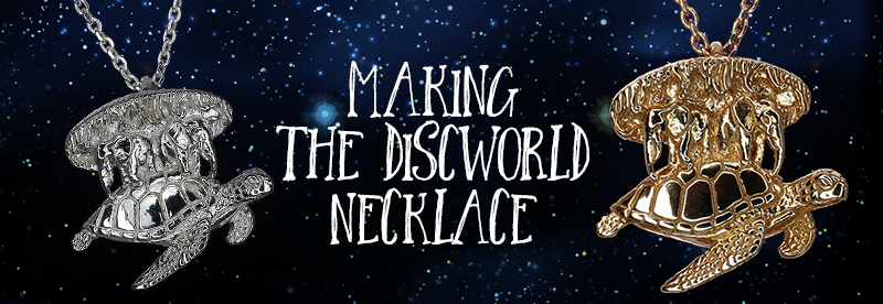
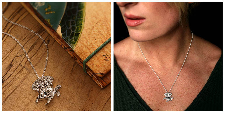
There were stylish new Discworld items released last year, starting with our suitably dark Assassins’ Guild Alumni T-Shirt, followed by our most ambitious piece of Jewellery to date, the Discworld Necklace! This stunningly detailed and oh so elegant rendition of Great A’Tuin is double sided and available in sterling silver or plated in gold, gold gold!
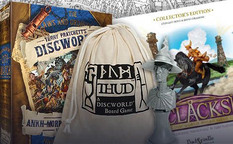
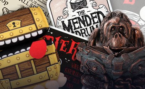
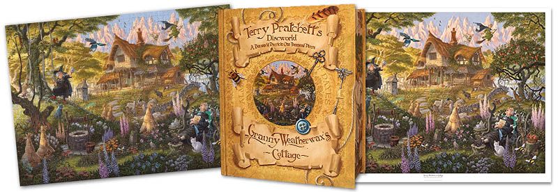
Puzzle addicts were treated to TWO Discworld Jigsaw puzzles, featuring incredible illustrations of The Mended Drum and Granny Weatherwax’s Cottage respectively., each designed by us and illustrated by David Wyatt. Both images are also available to own as big and beautiful art prints. Halloween saw the release of more bewitching wares with our ‘Blessings Be Upon This House’ lean-print featuring Nanny Ogg and Granny Weatherwax, also by the talented Mr Wyatt.
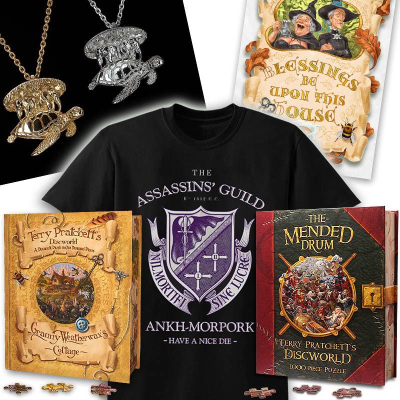
One of our favourite items to conclude the year’s offerings was the Ankh-Morpork City Watch Badge – Special Constable’s Edition. Sculpted by master jeweller Bethan Williams and forged by one of the UK’s oldest pewter companies A. E. Williams established in 1779, this magnificent Watch badge is a truly authentic prop-quality replica of a badge that has seen years of noble service under Commander Sam Vimes, Angua, Carrot & co. on the mean streets of Ankh-Morpork! – Fabricati Diem Punc!
![]()
Speaking of the Watch, the cast for the forthcoming adaption of Terry’s City Watch books by BBC Studios for BBC AMERICA was revealed last year. It has become clear that the production is very much ‘inspired by’ rather than ‘based on’ the original texts, but the proof is in the ‘watching’ and we truly hope that this eight-part comic thriller written by Simon Allen will still be a lot of fun.
Nonetheless the Watch has certainly made waves in the fan community with its bold stylings and deviations from the source material, so for the concerned and confused we heartily recommend reading an article from our mates at Discworld Monthly which charts a fulsome history of this adaptation…
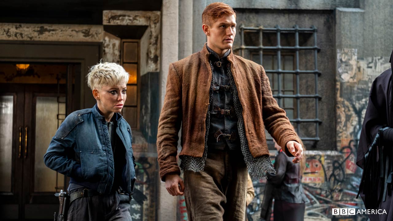
Regardless, there couldn’t be a better time to get reacquainted with the watch we all know and love, so we’ve been working on our own faithful depiction for a new puzzle and print due to launch this year. In the meantime, go and pick up a Pratchett to read, or treat yourself to a new edition of Guards! Guards! Men at Arms, Feet of Clay, Jingo, Night Watch, Thud!, The Fifth Elephant or Snuff!

AAAANNND FINALLY… Perhaps the best new arrival of 2019 came in the form of a small human! Ian and Reb welcomed their first child to the world in June, and we’re all rather smitten with our new mascot!
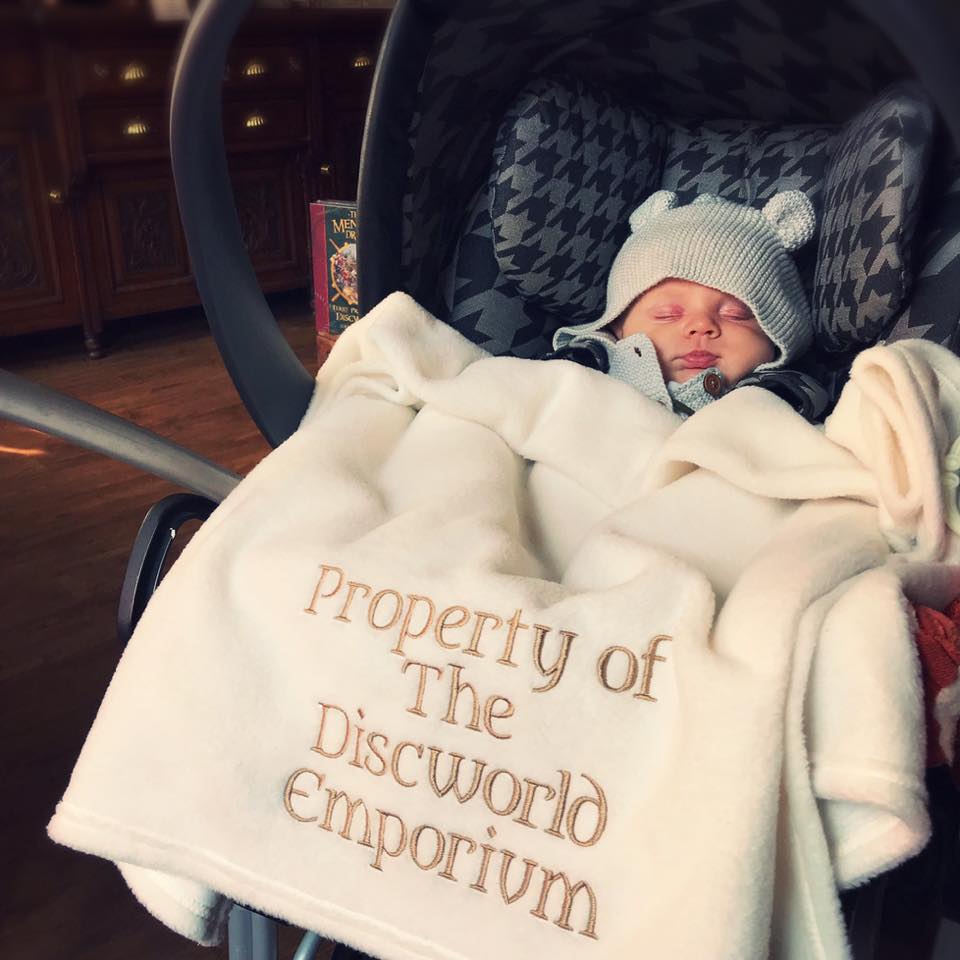
Being such a tiny team, this little charmer has meant that we’ve been a bit understaffed and overstretched for a while, so we praise the gods for our fabulous staff for keeping the cogs turning and thank you all for your support and understanding in what was a most exciting and exhausting year!
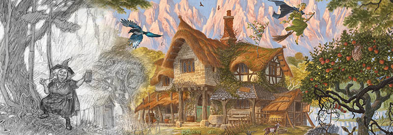
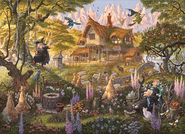
It’s a late-summer evening, where high among the spires of the Ramtops the slow light of the Disc is pooling in the forests of Lancre. Icy peaks tower over a clearing in the trees, in which nestles Granny Weatherwax’s fungoid cottage, the crisp, cool mountain air thick with the heady scents of a damp forest floor, Granny’s herbs and woodsmoke.
As with Terry Pratchett’s wonderful witches books from which our image is drawn, it’s almost a fairytale. In a world where things tend to go a little ‘Black Aliss’ every now and again, we set out with illustrator David Wyatt to create a rendition of Granny’s homestead that is on the edge…
“An edge witch is one who makes her living on the edges, in that moment when boundary conditions apply – between life and death, light and dark, good and evil and, most dangerously of all, today and tomorrow.”
– Terry Pratchett, Thief of Time
In Granny Weatherwax’s garden, on the edge between day and night as summer turns to autumn, we gaze upon an idyllic storybook scene. The freezing blue sky hangs over peaks blushing in the sunset as the woodland denizens are changing shifts; an owl rouses in the apple tree as the swallows head to roost, while the hare and the hedgehog (unbuggerable as he may be) exchange a glance as they share the clearing momentarily.
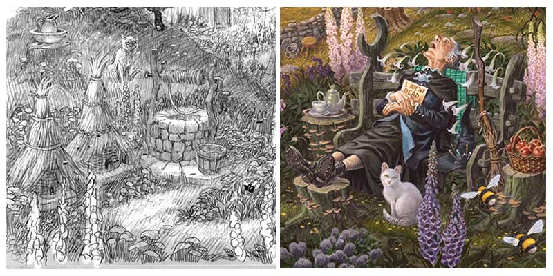
In the quiet of her garden, Granny Weatherwax reclines on an old goat blanket on a bleached bench, surrounded by the Herbs, the hives and her de facto familiar, You the cat. Her borrowing sign is held to her chest to prevent any unfortunate misunderstandings.
Our exclusive Discworld Jigsaw Puzzles are famed for all the wonderful details from Terry Pratchett’s books that we pack into each image. When depicting Death’s Study and The Unseen University Library for our previous puzzles, we were able to define spaces and places with numerous and often iconic physical objects; a bottle of Wow-wow sauce here, a sodding great scythe there, and books as far as the eyes can see. When it comes to the Hag o’ Hags however, Granny Weatherwax is almost defined by her paired-down existence; Esme’s life is one of bare necessities. Headology doesn’t rely on objects or belongings, and she can’t be doing with literature or frills.
However there are a few well-described details that speak directly and unmistakeably of Granny, notably her pointy hat, her borrowing sign, her battered broomstick and her house…
“A witch’s cottage is a very specific architectural item. It is not exactly built, but put together over the years as the areas of repair join up, like a sock made entirely of darns. The chimney twists like a corkscrew. The roof is thatch so old that small but flourishing trees are growing in it, the floors are switchbacks, it creaks at night like a tea clipper in a gale.”
– Lords and Ladies, Terry Pratchett.
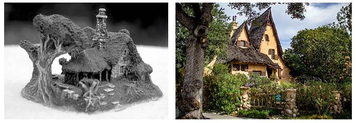
Long ago in the mists of time Bernard created Granny Weatherwax’s Cottage as a sculpture directed by Terry Pratchett himself. Ever faithful to portrayals devised in Terry’s presence, this depiction provided the basis for the design in our new rendition (with perhaps a bit of Los Angeles’ famous landmark, the Spandena House AKA the ‘Witch’s House’ thrown in as a fun reference).
However, the house itself perhaps plays second fiddle (or should that be banjo) in our image to the outside space which comprises the possessions Granny treasures the most, being her hives, her goats and perhaps most notably the Herbs:
“ … strange plants, hairy or squat or twining, with curious flowers or vivid fruits or unpleasantly bulging pods. Only Granny knew what they were all for, and any wood-pigeon hungry enough to attack them generally emerged giggling to itself and bumping into things (or, sometimes, never emerged at all).”
– Terry Pratchett, Equal Rites
We’ve had a lot of fun depicting as many bare essentials from Esme’s life as possible, from the tattered windsock and cup of tea, to the soft fruit bushes and her decent milking stool. To a newt fished out of the well bucket and an outhouse furnished with the nice soft pages of the Almanack. Not forgetting the water butt, because we all know that Granny Weatherwax can’t be doing with baths, them being quite unhygienic…
“‘First thing she does in the mornings, rain or shine, is wash her face in the water butt,’ [Nanny Ogg] said. ‘Someone broke the ice two hours ago. You can see where it’s frozed over again.’”
– Terry Pratchett, Carpe Jugulum
While these details are important for conveying character and setting the scene, they don’t imply as much narrative from Terry Pratchett’s books as the items included in our other puzzles. With that in mind, we wanted to emphasise another of Granny’s signatures, the act of ‘borrowing’, or riding in the mind of another being. Apart from a recumbent Weatherwax, you might just notice that her bedroom window has been left open, as she always did when borrowing late at night. If you look even more closely you’ll find that the eyes of every living creature in the scene are fixed on us, the viewer, so although we don’t know exactly ‘where’ Esme is, you can be sure she knows that we’ve come to visit.

Speaking of visitors, what would Granny Weatherwax be without her faithful coven of witches? This peaceful scene is about to be disturbed as Gytha Ogg trudges over a mossy tump, enjoying an evening tipple, her fragrant pipe smoke coiling through the sunbeams. While overhead we see Magrat aloft on her brrom, her dandelion hair fluttering around her face, shedding flowers and beads as she comes in to land.
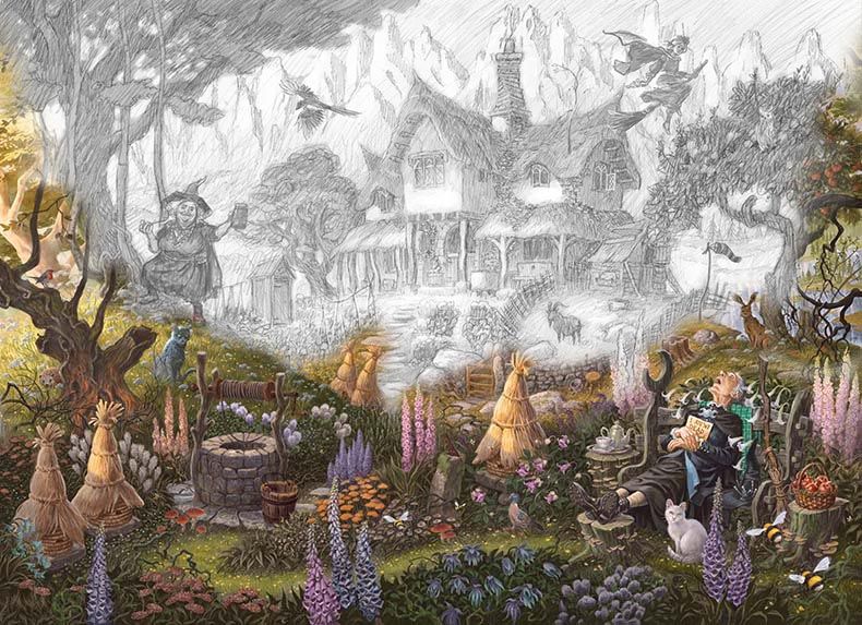
Once again David worked from a detailed brief, accompanied by a series of conceptual sketches which provided him with a composition, plusall the elements to be included in the image, along with a colour pallet, mood and lighting details. He created a fabulous pencil draft which was then overlaid in sections to allow fine tuning of layout and any additional details to be easily worked into the scene. Piece by piece Granny’s world came into being with a little tweak here, and a sprinkle of magic there…
Esme Weatherwax is one of the strongest female characters ever written in the ‘fantasy’ genre. She was written for over thirty years. She can never be captured in one image, and as Terry used to say, the best images are the ones on the insides of your eyelids, but as an Emporium favourite, we hope you’ll enjoy this intimate little moment that we captured of her fantastic life.
“Tiffany thought of the little spot in the woods where Granny Weatherwax lay. Remembered.
And knew that You had been right. Granny Weatherwax was indeed here. And there. She was, in fact, and always would be, everywhere.”
― Terry Pratchett, The Shepherd’s Crown
If books are gateways to other worlds, the opening words of Terry Pratchetts’ first Discworld book are a well-worn threshold, polished by millions of travellers all heading out on a Discworld journey that for most, lasts a lifetime. The first lines of the greatest fantasy saga ever written, shaped by the creator some three and half decades ago, have welcomed countless readers to the Discworld. Truly, in the beginning, was the word… and the word was a world.
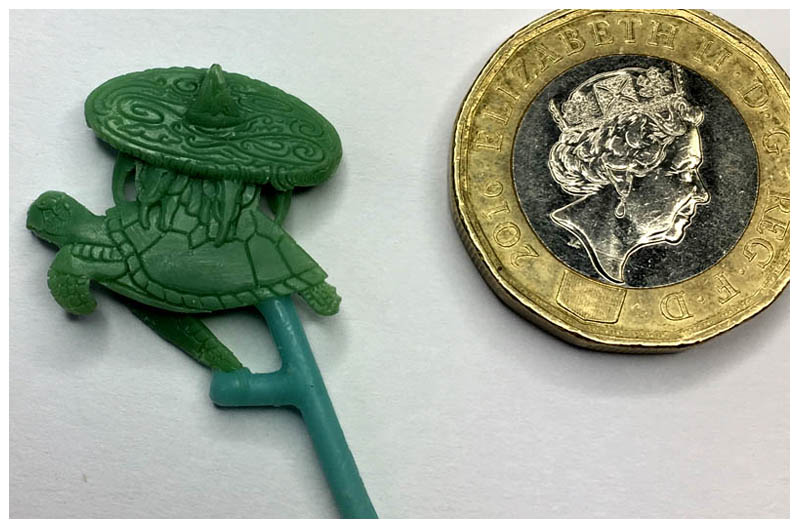
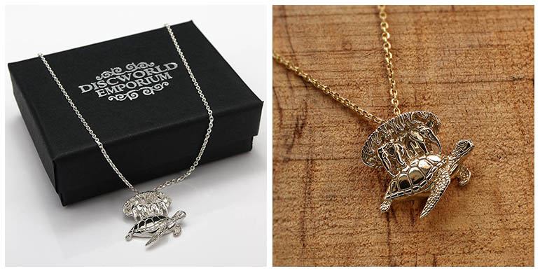
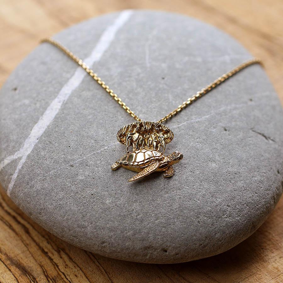
Great A’Tuin is the ultimate symbol for the innumerable hours that many of us have spent In Terry Pratchett’s fantastical imagination. The real world can be a serious place and so, we wanted to create a special piece of Discworld jewellery that would enable fans to wear Discworld close to their hearts each and every day. A reminder of the magic, wonder and wit of Terry’s words in theses interesting times and a talisman to protect against sense of humour failures… a small memento of Terry’s books as precious as the world turtle itself!
Depicting the entire Discworld is no mean feat. Not just because it includes multitudinous dimensions invisible to the human eye, or because there is very little visual reference for ancient world-turtles floating through space while covered in colossal pachyderms and geography. It’s actually very difficult to create a composition that incorporates adequate aspects of both turtle and elephants and shows a pleasing proportion of the Disc. If you gaze down on Discworld from above the elephants are obscured, except for a protrusion of trunk or tusk perhaps. If staring elephants in the eye, the surface of the Disc would be lost. To sculpt the world is all its dimensions would result in a pendant that would be rather uncomfortable and impractical to wear – a statement piece for the few and not the many.
We therefore decided to depict A’Tuin in detailed low-relief… but to legibly describe an elephant-borne planet atop a star turtle in a depth of 3mm or less is an unreasonably tricky task. Thankfully, we at the Discworld Emporium are not reasonable people. If working with Sir Terry Pratchett and almost thirty years of creating Discworld merchandise has taught us anything, it’s not to be constrained by reality. We gleefully began designing a brief, knowing full well that the actual mechanics of the producing the thing would be someone else’s problem…

Technology is a wonderful thing, and the advances in digital modelling and 3D printing would potentially have given us unrivalled control and accuracy throughout the sculpting and production process. The thing is, we’re good old-fashioned, old-school craftspeople who believe that the soul of a piece comes alive when forged by the human hand – the greatest tool any of us is ever given, and wonderfully imperfect. Perfection is, sometimes, overrated. A piece like this can be made so precisely that it might look perfect, it sometimes ends up feeling wrong. This little pendant was too important to trust to a cold, unfeeling machine. Thankfully, through Discworld, we’re lucky enough to know some of the most exquisite makers in the world, many of whom are still free to walk the streets. One such person is Bethan Williams, a delightful human being who, when not gardening, carves wax like no one else we’ve met. Not only is Bethan highly sought after by very important clients from all over the world (including a certain royal family here in Britain, who shall remain nameless), she’s also a massive fan of the Discworld books, So when we approached her with our designs, she was only too happy to set to work, building a weeny world!
To understand the level of skill required, it’s important to point out a few difficulties involved in creating a miniature Discworld that might not be mmediately apparent…
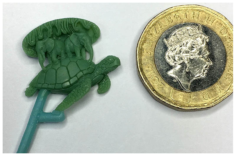
Firstly, Bethan needed to work at a tiny scale – they simply don’t make tools for cutting scales onto tiny giant flippers… so she made her own. From eyes to tail, A’tuin has been sculpted in incredible detail using Bethan’s bespoke techniques requiring intense concentration and control of hand.
Secondly, wax is a wonderful material to carve, but is soft and melts at low temperatures, so when working on such a small intricate piece consideration had to be given as to how to store and support the work whilst carving it! On warm days the wax was refrigerated for a while before it could be worked on successfully, and to avoid damaging the finished areas, sprues (small sticks of wax) were attached by which the piece could be held by hand piece without it getting too warm – even body temperature can affect the surface of the wax, making it sticky and difficult to keep clean.
Thirdly, sculptors rely on light and shade to decide on shape and form. Sculpting a bust in clay or marble, you know that the form will cast certain shadows. When sculpting in wax on a small scale, you must have good strong lighting to emphasis the carved lines, so that their depth can be seen. However, when worked thinly wax can bear a slight translucence, making things more confusing! It takes a huge amount of experience to able to imagine how the light will play on the finished cast piece, and to know therefore how to make each element clear and readable.
Despite aforementioned challenges, Bethan decided that a Discworld Necklace was such an important creation that is was deserving of elevation beyond the brief. Being so diligently attentive to detail, potty for Pratchett, and passionate about the piece, Bethan took the initiative to make the pendant double-sided so that the most distant elephants, and top of the Discworld were represented. Even Cori Celesti has been carefully carved to stand proud of the Disc and incorporate the chain loop to make this stunning pendant that bit extra special.
In his second Tiffany Aching book, A Hat Full of Sky, Terry Pratchett wrote the hallowed line ‘It’s still magic even if you know how it’s done’. Sometimes, we think it’s even more magic when you know how it’s done. It’s often tempting to think that the objects we surround ourselves with simply pop into existence. We’re so proud of our little Discworld that we thought we’d share a little bit of the magic that’s that goes into the production of each necklace once the original has been sculpted.
Bethan delivered the finished wax to our trusted jewellers in Birmingham, where fine silicone rubber that would pick up every minute detail was poured over the piece to create the first mould from which a master pattern could be cast in precious metal.
From the master, a production mould was made, enabling us to produce multiple copies of A’Tuin in a specialised casting wax. Using a hot knife and a steady hand, Twenty wax pendants were carefully attached via wax sprues to a wax column, known as a ‘casting tree’. This tree of pendants was then dipped repeatedly in a a specialised jeweller’s casting plaster known as ‘investment powder’ to create a ‘ceramic shell mould’ of about half an inch thick. When dry, this hard case was fired to melt out the wax, leaving perfect hollow impressions of our original patterns and a perfect production mould for pouring molten precious metal. This method of casting is known as the ‘lost wax’ or ‘cire perdue’ technique (as the wax is burnt away and lost for ever!), and has been in use for thousands of years. Refined over centuries, the lost wax method enables the accurate reproduction of intricate details – perfect for a precious Discworld Necklace!
To create the final A’Tuin pendants, the finest sterling silver is heated and gently poured into the mould. Once cool, the ceramic shell is smashed to reveal the precious silver tree of pendants inside. The sprues are removed to be melted and reused, however the mould is lost forever – yes readers, for every casting a new wax tree of turtles has to be created and a new mould made! Once fettled and cleaned each piece is hand-polished to bright and shiny perfection and threaded with silver chain, its keeper ring lasered permanently onto the end. Our gold-plated edition Discworld Necklaces are then trusted to expert gold platers a mere stroll from the casting house to receive a perfect coating of precious gold, gold, gold. The finished necklaces are then sent to the Birmingham Assay Office to receive their official silver hallmarks and our exclusive DW Discworld sponsor mark.
Each Discworld Necklace is made to our exacting standards, by proper crafts folk here in Britain who we know and trust to bring our creations to fruition. It’s not easy making a living with your hands these days, but there’s no better way to ensure the quality of finish that befits this stunning little keepsake of Terry Pratchett’s books. We’re utterly thrilled with the finished piece, and all that it represents. If you choose to own this special piece of Discworld jewellery, we hope you’ll enjoy fruits of all that has gone into the creation of a little tiny world that you can wear around your neck!
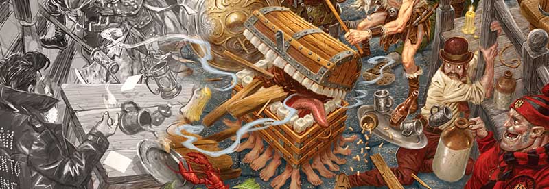
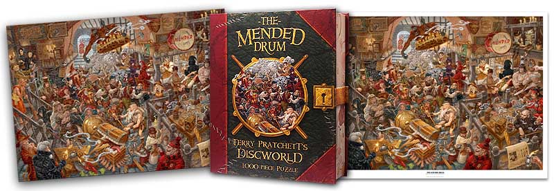
As a trope, the ‘Fantasy Tavern’ has done particularly well for itself. From Fritz Leiber’s The Silver Eel to Tolkein’s Prancing Pony, and Star Wars’ Mos Eisely Cantina, whenever these establishments bring together rag-tag bands of adventurers in close proximity to alcohol, narrative is sure to follow. As a plot device, they’ve done a roaring trade in both fantasy literature and in the expanding platforms of the genre at large. Which self-respecting Dungeons and Dragons player hasn’t felt the icy stare of the amassed inhabitants of some quasi-medieval drinking hole? Considering this rich heritage, the Drum still takes some ‘beating’! It’s a place where watchmen and wizards converge, where foot-the-ball fans and fools congregate… where you can rub shoulders with barbarians and librarians. It’s the ideal setting for an illustration of life in the Big Wahoonie.
In its various guises, the Drum has been mentioned in over a third of Pratchett’s Discworld novels, playing host to countless scenes from the auspicious meeting of Twoflower and Rincewind, to the fateful debut of the Band With Rocks In and to the romantic rendezvous of Moist Von Lipwig and Adora-belle Dearheart. The Mended Drum is a real hub (apart from THE Hub of course) of the series and, with help from Emporium artist David Wyatt, we thought we’d honour the dubious charms of one of fantasy’s finest dens of iniquity with this stunning rendition for our latest jigsaw puzzle and art print…
The Drum is Disc-renowned as being a melting pot of Morpokian culture, so much so that since Twoflower’s first tourist visit, it has become a hot destination for those looking to sample the local nightlife and lowlife, and to satisfy their morbid curiosity for the finest quality bar fights and unreal ales. It was imperative therefore that we give onlookers to our scene a suitably authentic experience with all the thrills, literal spills and colours thereof.
We chose a multichromatic palette with rich warm hues to highlight the atypical candlelight of a fantasy tavern and to lead the eye around the Drum by picking out wizards’ robes and furnishings with rich reds and oranges. David used the same process as he did our Death’s Study and Unseen University jigsaw puzzles and prints, creating pencil sketches to establish composition and perspective, and working in sections with move-able elements before adding colour layers and washes.
The frantic movement in the scene is provided by a swinging cartwheel chandelier, centralised fighting and the abundant flying of barbarian and blue collar limbs (an Igor is on hand to lend a hand of course!). Colour, composition and movement come together to make this an authentically riotous rendition of Ankh-Morpork’s notorious tavern!
“Okay, it’s well past knuckles time, let’s say Gravy there has done his thing with the Bench Swipe, there’s a bit of knife play, we’ve done the whole Chandelier Swing number, blah blah blah, then Second Chair—that’s you, Bob—”
– Terry Pratchett, Going Postal.
The Drum has been a fixture of Discworld since the very beginning, and although it’s undergone one or two notable… renovations… it remains the tavern of choice for the Glod, the bad and the ugly of Morporkian society. From The Colour of Magic, when the Broken Drum had to hire Detritus as a splatter (like a bouncer, but trolls use more force) to its last appearance in Going Postal when a group of seasoned brawlers are seen discussing the finer points of fight choreography, the Drum has withstood time and narrative, its characterful clientele and their exploits remain just as fervent.
We wanted to cram in as many details and allusions as possible, spanning the depth and breadth of the Drum’s illustrious history. With that in mind, should you choose to avail yourself of this piece, we challenge you to spot the following familiar faces and devilish details from Ankh-Morpork’s favourite pub…
A Wizzard, CMOT Dibbler, Death, Cohen the Barbarian, Dotsie and Sadie the Agony Aunts, Sgt. Angua, The Librarian, The Dean, The Senior Wrangler, Adora Belle Dearheart, Foul Ole Ron, Lu-Tze the Sweeper Gaspode the Wonder Dog, The Luggage, Igor, Reg Shoe, The head of the Thieves’ Guild, A certain author’s black hat, A fool, An Assassin, A Vampire, Goblins, A Troll, Dwarfs, The Band With Rocks In poster, A Game of Thud, A Swamp Dragon, and advert for Vimes’ cigar of choice, An Iconograph, The Ankh-Morpork times, Someone who should ‘learn the words’, at least four Discworld beers…
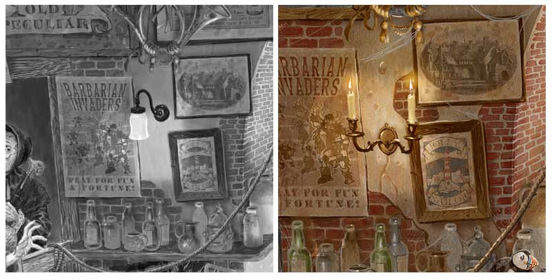
In 2012 we had the privilege of working with Terry to create The Compleat Ankh-Morpork – the definitive guide and map to Discworld’s premier city. We thought it might be fun to include some of the advertisements for Ankh-Morpork’s distinguished spirits and brands from the book as signage and posters displayed inside the Drum.
Those featured comprise ingredients for a traditional Morporkian night out such as Winkles Old Peculiar, Jolly Sailor Tobacco, Jimkin Bearhugger’s Whiskey, Turbot’s Really Odd Pale Ale and Sonky’s rubber goods. David created a draft collage of suitable adverts to work out their positioning and cleverly repainted them to blend in with in their new surroundings.
The crafty artist also verged on the meta with the inclusion of a clever miniature version of his own rendition of the Mended Drum, originally created for us many years ago as a postcard and print drawn from Bernard’ ‘ Unreal Estate’ figurine.
Even the best Discworld Jigsaw Puzzle designers make mistakes when they’ve had a skinful! That’ll teach us not to ‘method’ approach when tackling certain subjects lest realms of Creative Uncertainty be ventured into!
For instance, we almost forgot to signify Foul Ole Ron’s unique stench in the original sketch – BUGGRIT! During the colouring process we became aware that something stank.. or rather didn’t stink enough!! Foul ole Ron and Gaspode’s pong wasn’t evident, so David added whiff marks to highlight the veteran Beggar’s unique perfume.
Electric lighting in the Drum?! We obviously got carried away with the more recent advancements in Ankh-Morpork’s technology for a moment and forgot where we were! This sneaky little lamp was switched for a candelabra, and we added in some cracks and weathering to the patches of render after the retrofit!
Whenever one attempts the rigours of artistic endeavour, proper research is imperative to fully understand and express the chosen subject. Just as the great masters of the renaissance studied the mechanism and structure of anatomy to better capture the minutia of the human form, the Emporium team dedicated themselves, nobly and selflessly, to examination of our latest topic. It’s not enough to simply draw a pub, to do justice to the Mended Drum our team devoted countless hours to conducting tax-deductible fact-finding missions to many and varied hostelries here in Somersetshire, all the name of bringing you, dear reader, the highest quality illustration that you so richly deserve.
And lo, the latest instalment of our catchily-titled series ‘Meticulously-intricate-illustrations-of-some-of-Discworld’s-most-iconic-settings-with-lots-of-lovely-details-from-the-books’ is born!
We hope that our completed rendition of The Mended Drum will capture the ‘spirit’ of Discworld’s disreputable drinking hole. This raucous image is packed with hidden references and allusions to Terry Pratchett’s incredible books that will to keep any Discworld Disciple or plucky puzzler entertained for days. As a print (coming soon), it provides a home from home, a scene to raise a smile at and possibly a pint of Winkles Old Peculiar!
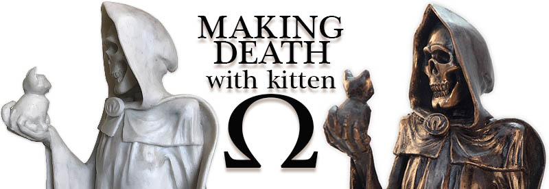
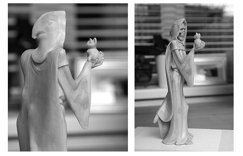
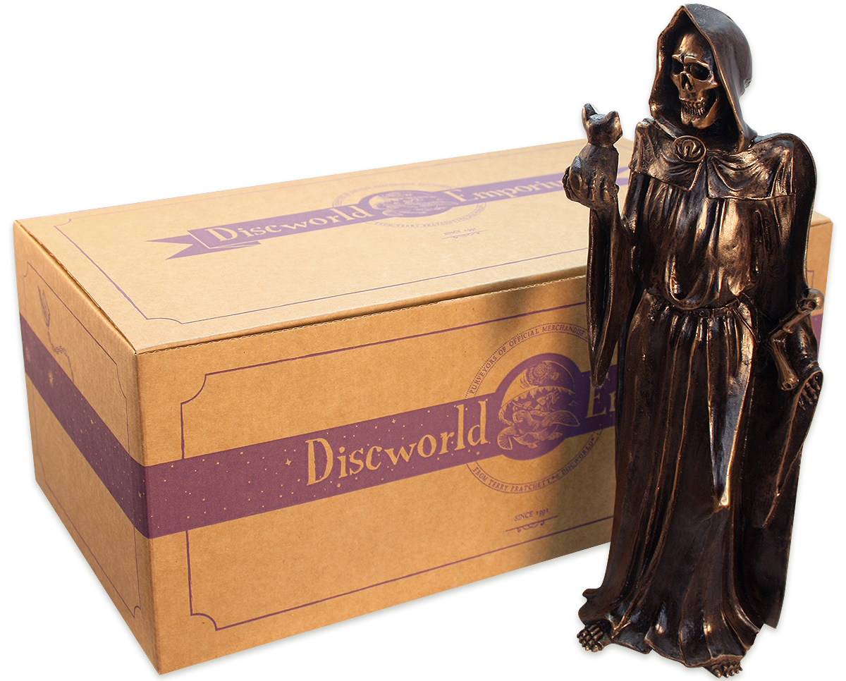
Some of the greatest things in life come ‘LATE’, especially as far as Death is concerned. Although we released our latest Discworld figurine back in October, Death proved so popular over the hectic Hogswatch season that we deferred blogging about him until we could be sure stocks were suitably replenished (we believe this is what young people might refer to as a ‘humble brag’). With that said, we hope you’ll enjoy this little ‘making of’ article…
Death. One of Discworld’s most ENDURING characters. From the Colour of Magic, to the Shepherd’s Crown, Death makes a personal appearance in nearly all of Terry Pratchett’s incredible Discworld books. His character has developed over 30 years with countless Discworld fans having grown up or grown old-er with Death as a constant companion. Throughout the series, Death conducts his duties in his own curious, unflappable and caring way – a not-so-Grim Reaper full of charm despite being up to his eye sockets in mortal demise.
Terry Pratchett’s Death is one of the few Grim Reapers in fiction that we welcome, and enjoy encountering a real literary phenomenon. At times he’s the lead, implacably driving the story with purpose and pace, at other times his cameos provide objective reflection and a little light relief after a death scene. No-one does ‘deadpan’ like a 9ft skeleton. From the outside, Death might seem like an unlikely hero. But why is it that the Reaper Man should be grim? Why should someone privy to the combined wisdom of the multiverse not wonder at the little things in life? He’s at once unfathomable and utterly relatable.
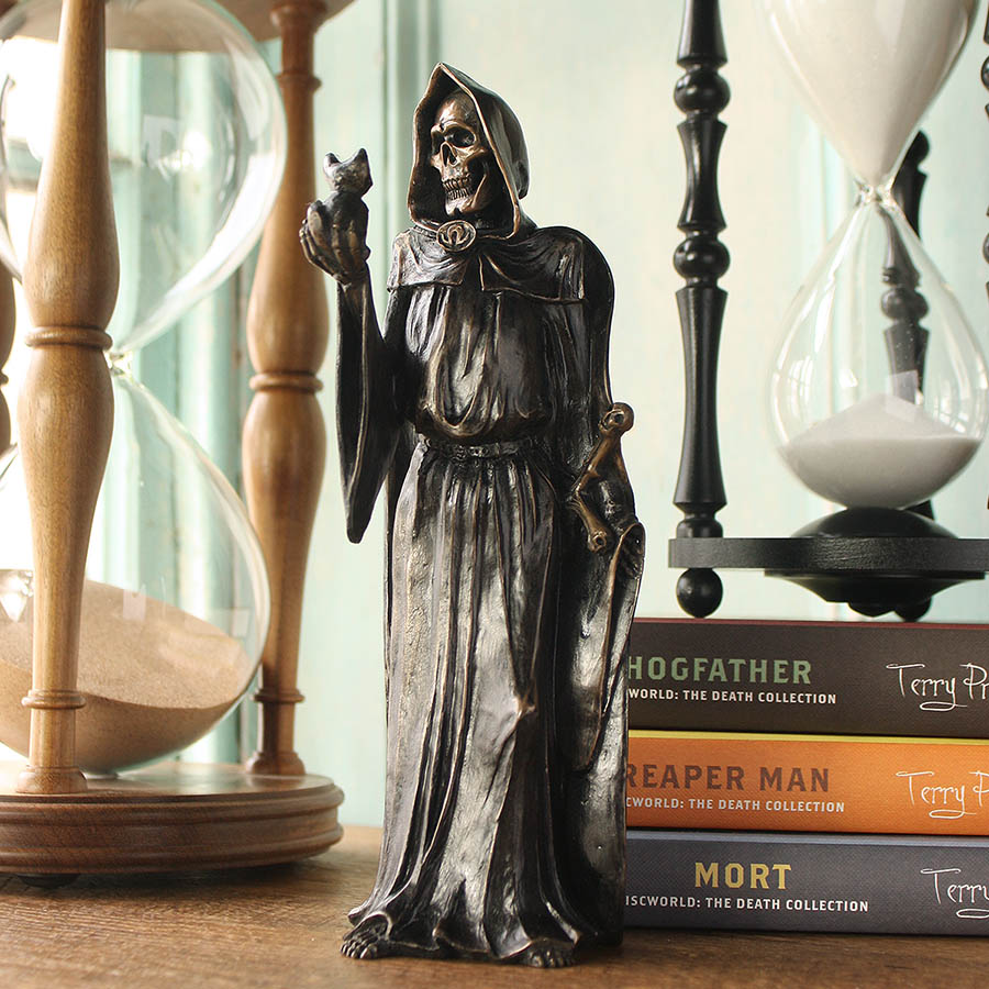
For our latest figurative piece, we wanted to capture Death in a decidedly Discworld depiction. The trouble with Death is however, that Death is universal. It’s difficult to create ‘Him’ in a way that sets him apart from the death one may encounter in any old generic gothic sculpture or Halloween trinket. A skeletal figure with a black robe and scythe is a bit… expected. It was essential to capture what makes Terry’s anthropomorphic personification of the ultimate reality, utterly unique.
We wanted to show the ‘human element’ of the immortal representation of death. We decided to show Death face to face with another of the most powerful supreme beings of the multiverse… a fluffy kitten. Capturing this moment with the kitten we share a moment of interaction, that reflects death’s ability to be ‘human’ …and his famous fondness for cats. This furry feline immediately sets our Death firmly on the Discworld and gives focus to the piece, the fixed gaze adds so much expression to the figure.
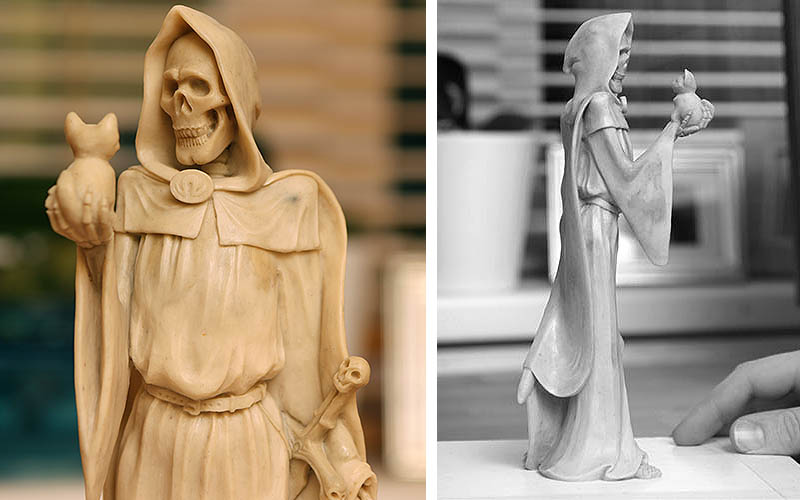
In the novels, Death is remarkably expressive for someone lacking in the facial features department. This is all well and good in prose, where special effects are cheap and convincing, but in sculpting wax it’s much trickier to achieve! We had to work hard to instil a little expression into an inanimate skull. We wanted to keep him looking relatively natural, rather Instead of a melodramatic, ominous stance atypical of generic representations of Death.
This necessitated the understated curiosity you see in the final piece. Giving Death something to consider in what we like to call the ‘poor Yorick’ pose, added so much to the figurine. Although his scythe has been replaced with something far fluffier, Death still wears his distinctive sword, utilised for the reaping of royal souls, complete with with skull pommel and cross guard detailing, to show that he very much mean business when it comes to the figurative end of the line and that he is, kitten aside, the ‘”Assassin against whom no lock would hold” – Terry Pratchett, Mort.
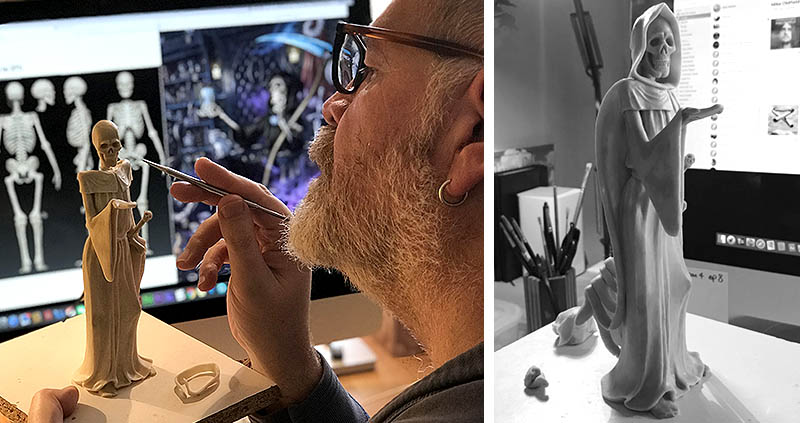
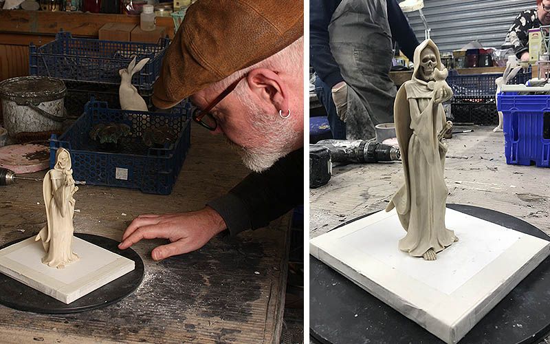
With the basic design laid out we could progress to the maquette stage. Once again, we called upon the capable soul of Rich Kingston to face Death and bring him to or ‘skeleton’ if you will, that he could pose whilst keeping the anatomy of Death in proportion. Once posed, Rich began pressing wax onto this base, building up Death’s form slowly. This meant that when it came time to add the robe, there were already substantial skeletal shapes over which to drape it giving a much more convincing finish to the elegant lines of the robe, allowing the effect of pointy shoulder and elbows to shine through.
It was (excuse the pun) ‘vitally’ important to convey that Death is a skeleton, but also to give enough mass for him to appear strong and imposing as opposed to wizened and weak. Rich achieved this in the delft draping of the robes gathered at the waist and proud positioning of the upper torso and ribs. The addition of a cloak billowing from Death’s shoulders gave us chance to create some elegant gothic lines and elevation to the piece. A bend at the knee and hips remind us of all that is (or isn’t) under the robes.
With the adding of the skull, robe, cloak, sword and omega embellishments the piece finally came to fruition, culimating in the placing of the tiny kitten in Death’s gentle bony hand.
With all this fine, flowing drapery, and delicate out-stretched arm, we were really pushing the limits of batch resin casting, but the piece demanded it. Again, we relied on the expertise of our dedicated casting team, based only a few miles from our shop here in Somerset. Which enables us to deliver the finished wax sculptures and oversee the production of our pieces in person (and say hello to our other Discworld figurines already in production!). The master mould-makers, casters and finishers at Carter Technical Castings once again helped us bring out the very best in the design. A simple, elegant ‘cold-cast’ bronze finish is achieved by casting real powdered bronze, bonded with resin, to give a surface that can be burnished, stained and hand-polished to give a shine, depth and weight that you simply couldn’t achieve with a painted finish.
We really hope you like our Death with Kitten figurine. As with all the things we make, we’re proud of this piece. With the help of some superb craftspeople, we’re able to offer something of real quality for less than a day’s minimum wage… which, excepting acts of cat, should last a lifetime.
+ + BUY NOW! ++
The mystic thingies have been wossnamed, and the omens are good! The year known to us as 2019 has been officially dubbed…THE YEAR OF THE INCONTROVERTIBLE SKUNK!
As we begin a year that will bring us the long-anticipated adaptation of Terry Pratchett and Neil Gaiman’s apocalyptic collaboration Good Omens, we thought we’d glance backwards before the world ends at what we got up to in the year of the Justifiably Defensive Lobster…
2018 began with an ending. The closure of the award-winning Terry Pratchett: Hisworld Exhibition in Salisbury marked an incredibly successful, yet suitably humble, celebration of our favourite author. Tens of thousands of Terry Pratchett fans descended on Salisbury Museum for a glimpse into his life behind the books with exhibits of private memorabilia and paintings providing an intimate portrait of the man in the hat.
We were privileged to have been a part of the exhibition’s creation, providing notepaper from the Ankh-Morpork Post Office for the memory wall, designs for coat hooks, and items of memorabilia on display.
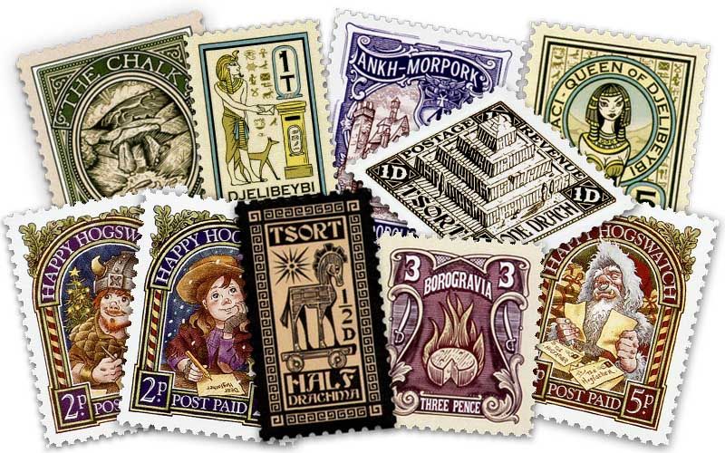
Discworld Stamps gave us new issues from exotic lands including Tsort, Djelbeybi, Borogravia, Uberwald, Hersheba, Quirm and the Chalk, The City Watch were also celebrated with the Pseudopolis Yard Watch House 4p.
Our Hogswatch offerings celebrated the theme of ‘Letters to the Hogfather’, comprising two heartwarming 2p issues featuring a little match girl and young dwarf penning their Hogswatch wishlists, along with a jolly 5p issue featuring the Hogfather himself were and were illustrated by our collaborator extraordinaire David Wyatt.
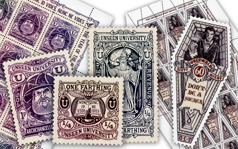
Closer to home the Ankh-Morpork Post Office introduced a beautiful set of stamps from the Unseen University. The Farthing, Penny and Penny Farthing issues feature beautiful linework illustrations of Ridcully, UU Coat of Arms, and the famous statue of Alberto Malich by the talented new guest artist Matthew Green. Matthew’s artwork can also be seen gracing the menu of two Michelin Star restaurant L’Enclume in Cumbria, a testament to our fine taste in illustrators!
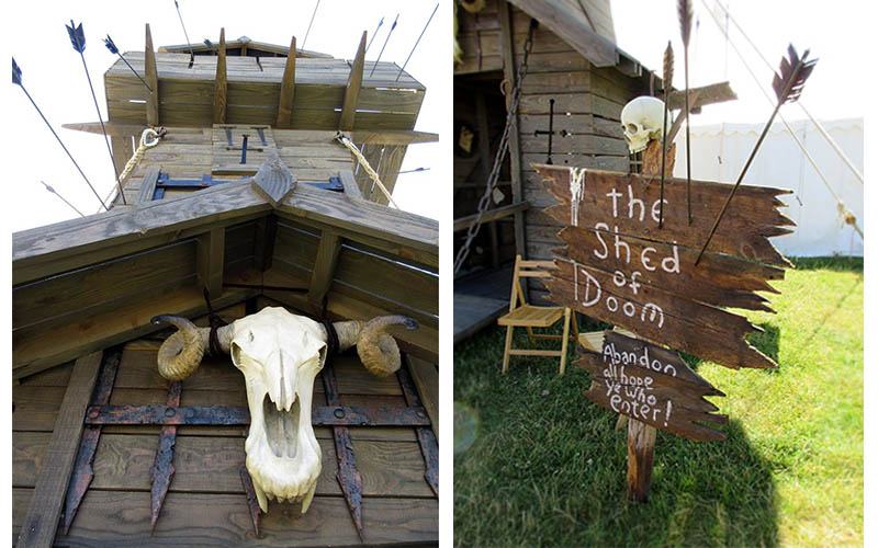
In June we visited the Chalke Valley History Festival in Terry’s home village Broadchalke, where Paul Kidby’s lifesize rendition of Evil Harry Dread’s Shed of Doom lead to a recreation of Terry’s office and various Kidby artworks. The shed provided a fitting tribute to a local hero at a festival held in Terry’s back garden with talks by Rob Wilkins.
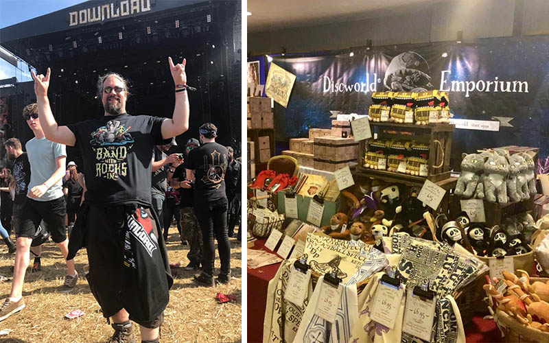
Festival season continued Discworld-style with our bestselling T-Shirt featuring The Band With Rocks in from Terry Pratchett’s Soul Music. This was rocked by Terry Pratchett fans all over the globe at music with rocks in festivals, while our Mended Drum shirt also proved a smash hit at festival bars and pub gardens throughout the summer! Thanks to those who shared pics of yourselves rocking your Discworld tees!
August saw the Discworld Emporium’s travelling shop hit the road to attend the International Discworld Convention in Warwick, where Ian, Bernard and Reb flogged our wares and took part in panels and talks that explored such topics as the origins of the Emporium, reminiscences of our time with Terry Pratchett, and our Discworld creations past and present. It was a pleasure to celebrate Discworld with friends old and new, and revel in the joy that Terry Pratchett’s books brings us all. We were also treated to sneak peeks of Good Omens and the fan-made Troll Bridge along with a script reading of the forthcoming Watch series for BBC America by writer Simon Allen ahead of its official public announcement in October.
At the end of November, our beloved Discworld turned thirty-five. This anniversary coincided with ‘The Gathering of Loonies’, an informal assemblage of fans held in Wincanton to kick off the festive season on what would have been (in Terry’s lifetime) our annual Hogswatch celebration. It was very special to spend Discworld’s Birthday with good friends, many in glorious Discworld costumes and many of whom have been making an annual pilgrimage to Wincanton since our doors first opened.
The Johnny Maxwell trilogy was released Bright new paperbacks editions with cover artwork by Mark Beech who’s illustration also graces the paperback of Father Christmas’s Fake Beard -the third collection of Terry’s short stories – released in October. The Amazing Maurice also had a revamp by Laura Ellen Anderson with a new characterful cover to tie in with her Tiffany Aching paperbacks.
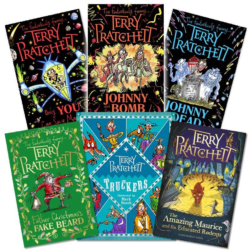
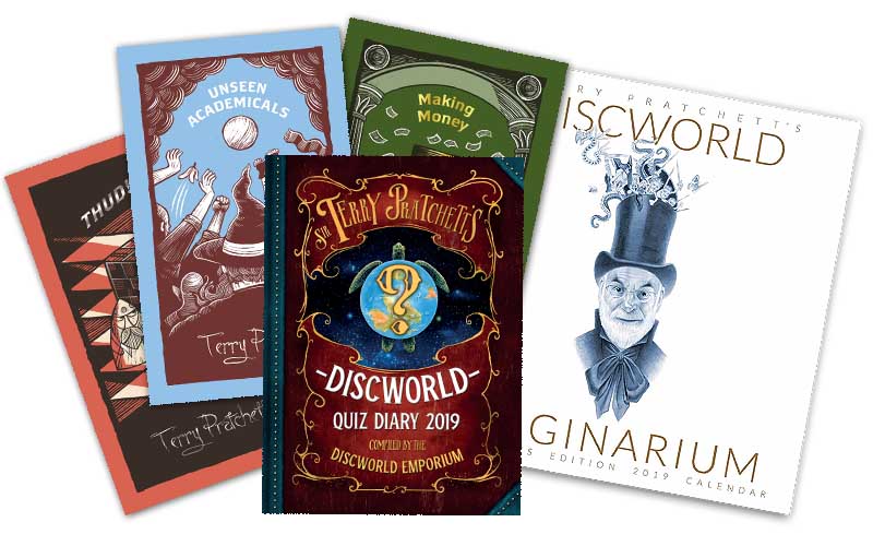
Our fourth official Discworld Diary was published in August by Victor Gollancz. For The Discworld Quiz Diary 2019 we trawled our archive of Discworld trivia to compile a Discworld Quiz that would satisfy both newbies and old hats alike! Tested by hardcore Pratchett aficionados, the Discworld Diary was shortly joined by the Discworld Calendar, full of imagery from Paul Kidby’s compendium of illustrations the Discworld Imaginarium!
The first product of the year was our bronze-edition Luggage figurine (and trinket box!), soon followed by our cast of 1000’s teatowel bearing the names of as many Discworld characters as we could squeeze onto a small sheet of cotton. In March our simultaneously adorable and terrifying Luggage plushy scampered onto the scene, proving a best-selling companion for Discworld fans young and old! The Luggage also ran riot over our new Discworld Socks, released alongside our Feegle Feet and Assassins’ Guild designs. The Assassins were also represented this year by our suave and sophisticated cufflinks – for style to die for!
Books are the heart, soul and raison d’etre of the Discworld Emporium, so it was long overdue that we introduced bookmarks to our range! Fate and the lady have conspired to bring us the talents of David Wyatt, who illustrated two sets of Discworld characters for our official Discworld ‘Ookmarks’- for books with even more character! A set of ten traditional ‘Ookplates’ are also available to lay claim to your precious Terry Pratchett library!

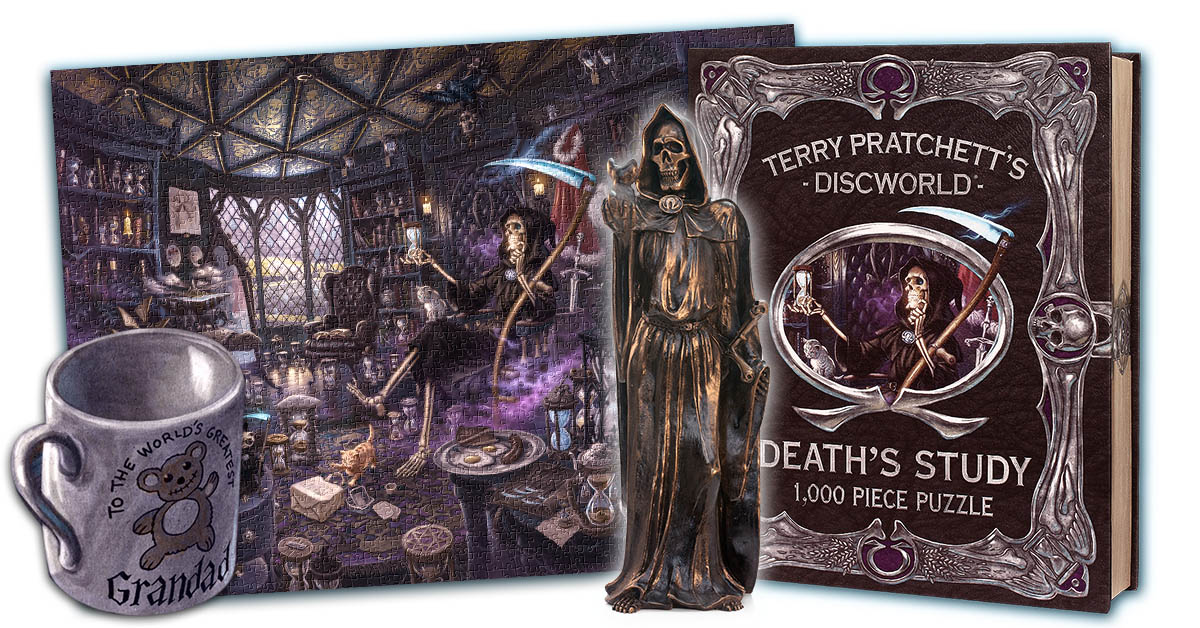
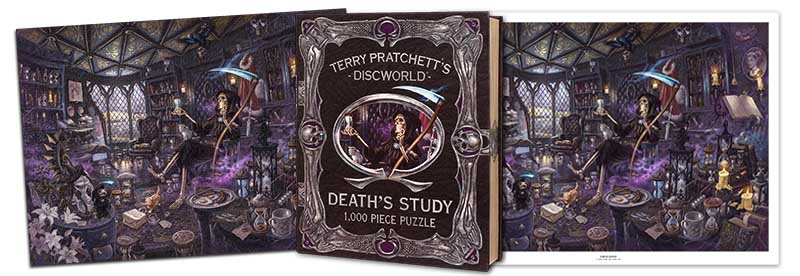
There was a puzzling addition to our range in September when Death’s Study was brought to ‘life’ for our third fiendishly difficult jigsaw puzzle. The Reaper man’s inner sanctum joined the Unseen University’s Great Library in our range of Discworld jigsaw puzzles illustrated by David Wyatt, designed to include a host of hidden details from Terry’s books. With such a stunning image, we just had to make an additional art print for those who prefer their artwork in one piece!
Death also made an appearance as our latest Discworld figurine produced in our signature bronze finish, while the release of our Tiffany Aching Snowflake neckace and Hogswatch stocking were a fittingly festive finale to our range of Discworld merchandise for 2018!
The year of the Justifiably defensive lobster was another year of reaching previously unchartered territories with the word of Sir Terry Pratchett and our Discworld wares, and a year of exciting announcements about forthcoming televisual extravaganzas!
Rather fitting for a production full of zombies, vampires and werewolves, the official press announcement that the long-anticipated City Watch series has been given the green light arrived on Halloween! The Watch will be adapted from Terry’s books by BBC Studios for BBC AMERICA, the company behind Killing Eve the current Doctor WHO as an eight part comic thriller Co-produced with Narrativia and written by Simon Allen.
Of course we are all looking forward to the end of the world this year, and back in July Amazon Prime Video gave us a behind-the-scenes sneak peak of Good Omens first shown at San Diego Comic Con, where Frances McDormand was announced as the “Voice of God” on stage by Neil Gaiman. Frances joins a stellar cast including David Tennant as the demon Crowley, Michael Sheen as the angel Aziraphale and Jon Hamm as the angel Gabriel for 2019’s most hotly anticipated apocalypse! The star-studded cast also includes actors Anna Maxwell Martin, Josie Lawrence, Jack Whitehall, Miranda Richardson, Reece Shearsmith, Nicholas Parsons, Derek Jacobi, Steve Pemberton and Mark Gatiss.
As we trundle forth into the year of the Incontrovertible Skunk we would like to thank you for your continued support and for being the best patrons a little literary shop could ask for! We hope the year ahead is full of magic, and remember… in a world gone completely Bursar we can always read a Pratchett!
THE TURTLE MOVES!
Cower brief mortals, and relieve the boredom of human holidays and Hogswatch with our latest creation, based on everyone’s favourite scythe-wielding anthropomorphic personification!
Last year the Emporium gang spent three months in the Unseen University Library – walking among its labyrinthine shelves, ducking the zip and sizzle of errant magic, breathing in the warm and bookish air – to bring you our vision of Discworld’s premier seat of magical learning. Those who chose to own this image, as either the fiendishly difficult 1,000 piece puzzle or pain-free art print, will hopefully realise how much care and attention went into creating this illustration. If the devil is in the detail, then there’s surely a special circle of hell reserved for David Wyatt, the esteemed author of this incredible image. We were thrilled by the response (and by the creative nature of some of the death-threats from the less-experienced puzzlers among you), thus, we’re very excited to reveal the next piece in our range of meticulously-intricate-illustrations-of-some-of-Discworld’s-most-iconic-settings-with-lots-of-lovely-details-from-the-books! (catchy title, eh?).
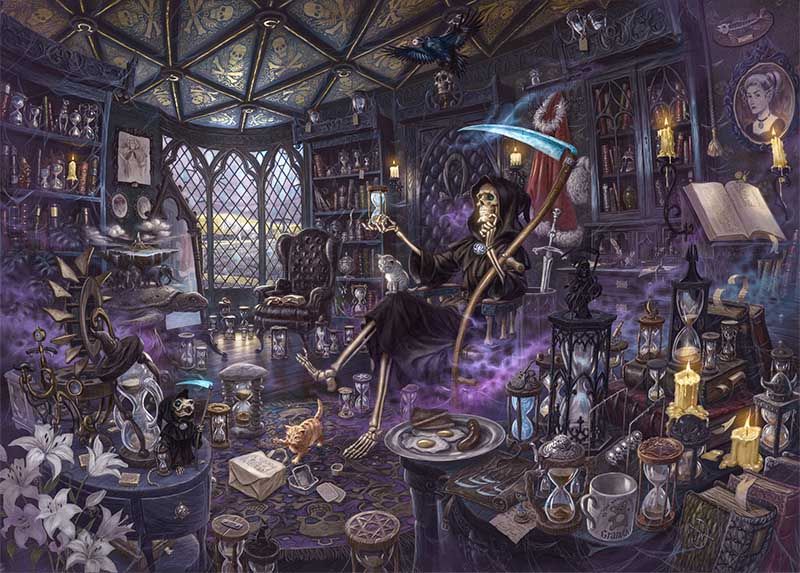
This time, we’ve been stalking the halls of Death’s domain. After all, even anthropomorphic personifications need a place to call their own. In Death’s house, his study provides sanctuary for the Reaper Man to reflect on life, the universe and fine Klatchian curries. But what does Death’s study look like? For that matter, what does it feel like?… how do you draw a room belonging to an eternal, all-knowing, all-seeing entity… and more importantly, where does one put the sodding cat?
But why Death’s Study? Rooms are extremely telling things. Little boxes we’ve devised to dwell within. In the bowels of the Emporium, there’s a very special room. It usually contains a very special man. One of our founding members, friend & accomplice to Sir Terry Pratchett, Mr. Bernard Pearson. This room is his ‘shed of dreams’ (like a memory palace, but cheaper). This room, perhaps more than most, epitomises it’s inhabitant. Like Bernard, it’s walls are a little wobbly and it smells faintly of ancient pipe smoke but it’s PLASTERED from top to bottom with stories. Objects of fascination, photographs of times and places and people crowd every surface. It overwhelms the senses, so like our dear friend, the Cunning Artificer; this room is as intimate a portrait of his character as any artist, writer or possibly psychoanalyst could possibly hope to provide.
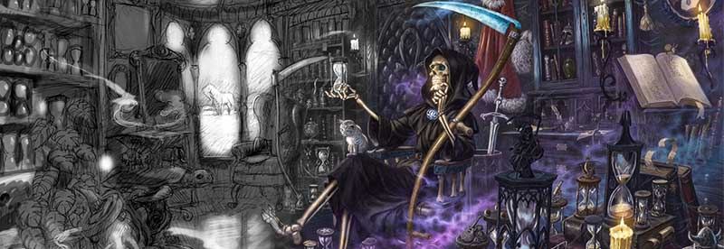
Similarly, Death’s study is a real extension of his character, every atom having been coaxed into existence all by HIMSELF. The character and the space he inhabits are inseparable. The room obviously needs to be executed in all the shades of black, and plastered with gothic skull and bone motifs, but knowing Death as we do, his home can’t feel gruesome, or even gloomy… perhaps the word we’re searching for is… sombre. This is, however, a room of two halves. There’s the formal furniture, the Tudor proportions, the uniform patterning – all very grand, solemn and… appropriate. But slowly, over the aeons, the humanity has seeped into Death and infiltrated his inner sanctum with mementos and nic-nacs that betray his fondness for the habits and pursuits of the living…
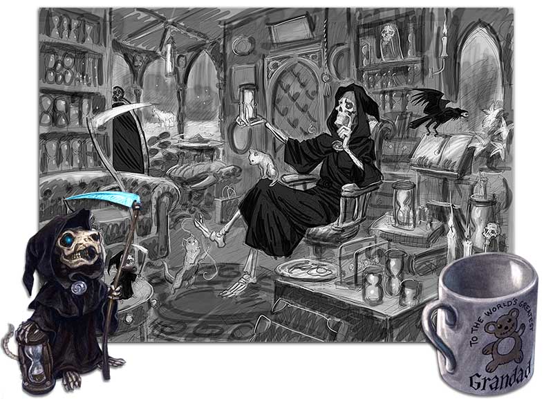
Our first rough sketch (pictured above) did not provide nearly enough space for all those souvenirs and trinkets from the eternally mystifying mortal realm. The ‘life’ in the room comes from the items that Death has collected on his travels; it is these the objects that tell his story. It was clear that all those little details from Terry’s books should abound and shine out from his sober surroundings…
“Someone somewhere wanted to make it a jolly mug. It bears a rather unconvincing picture of a teddy bear, and the legend ‘To The World’s Greatest Grandad’ and the slight change in the style of lettering on the word ‘Grandad’ makes it clear that this has come from one of those stalls that have hundreds of mugs like this, declaring that they’re for the world’s greatest Grandad/Dad/Mum/Granny/Uncle/Aunt/Blank. Only someone whose life contains very little else, one feels, would treasure a piece of gimmickry like this.”
– Terry Pratchett, Thief of Time
“Death had in fact studied a classic work on graphology before selecting a style and had adopted a hand that indicated a balanced, well-adjusted personality. It said: Gone fyshing. Theyre ys ane execution in Pseudopolis, a naturral in Krull, a faytal fall in the Carrick Mtns, ane ague in Ell-Kinte. Thee rest of thee day’s your own.”
-Terry Pratchett, Mort.
“Most of the books in the library were biographies, of course. They were unusual in one respect. They were writing themselves. People who had already died, obviously, filled their books from cover to cover, and those who hadn’t been born yet had to put up with blank pages. Those in between . . . Mort took note, marking the place and counting the extra lines, and estimated that some books were adding paragraphs at the rate of four or five every day. He didn’t recognise the handwriting.”
– Terry Pratchett, Mort.
“Contrivance’ was exactly the right kind of word for it. Most of it was two discs. One was horizontal and contained a circlet of very small squares of what would prove to be carpet. The other was set vertically and had a large number of arms, each one of which held a very small slice of buttered toast. Each slice was set so that it could spin freely as the turning of the wheel brought it down towards the carpet disc.”
– Terry Pratchett, Thief of Time.
Other items of note include the fry up to represent Albert, Death’s man servant; the roll of miniature scythes, for different sized creatures; The fish and a tiny fly, from Death’s fishing trip in ‘Mort’; the armchair in which Ysabelle would read the life stories of mortals; The Klatchian Takeaway, from Curry Gardens, Death’s favourite Morporkian curry house. Renata Flitworth, Mort, Ysabelle and Susan’s portraits adorn his walls. The velvet rope to summon Albert. Outside, Binky strolls in front of a band of golden wheat, the only real natural colour in Death’s endless realm. The Hogfather’s festive cloak and beard hang behind the door… and all around, the glitter of glass and sand…
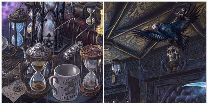
Lifetimers are Death’s eternal accessories. We know that Death studies the lifetimers of souls who pique his interest, and most lifetimers in our image represent a familiar Discworld counterpart. Whether it’s Vimes’ copper watchman’s badge timer, dents and all, or Nanny Ogg’s stein-handled timer, topped with a votive hedgehog, or Vetinari’s lofty, gothic timer – dark, complex and pointed… somewhat like it’s owner.
“Death had taken to keeping Rincewind’s lifetimer on a special shelf in his study, in much the way that a zoologist would want to keep an eye on a particularly intriguing specimen. The lifetimers of most people were the classic shape that Death thought was right and proper for the task. They appeared to be large eggtimers, although, since the sands they measured were the living seconds of someone’s life, all the eggs were in one basket. Rincewind’s hourglass looked like something created by a glassblower who’d had the hiccups in a time machine.”
– Terry Pratchett, The Last Continent
Thanks to the aforementioned descriptions from Terry Pratchett throughout the Discworld series, we had a great deal of material for this scene all detailed with such relish that the process of designing the space, illustrating each element, and fitting everything together in a cohesive and elegant manner was a relatively simple process. Not to mention huge fun. We wanted to achieve a glimpse into Death’s private sanctuary, capturing a rare moment to himself spent studying the timers of Discworld’s most ‘interesting’ denizens, with all those wonderful details not only giving puzzlers a huge amount of satisfaction, but evoking Death’s wit, charm and playful innocence. At the centre of it all, of course, is the Reaper Man, and Capturing the personification of the ultimate reality was undoubtedly a prospect more sobering than a strong dose of klatchian coffee.
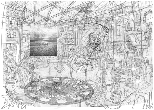
When devising Death’s characterisation, so many words skitter around the mind – Sage. Curious. Definite. Dare we say… sweet? There’s no one easy way to describe Death – it took Pratchett some thirty years, after all – but one word felt right for this image; Grandfatherly. From the illustrations of Paul Kidby and Josh Kirby to the films of the Mob and sculptures of Clarecraft, everyone has had to tackle HOW to show convincing emotion on a skull, an object which unsurprisingly tends to be a bit… poker-faced. He’s a fundamentally difficult character to capture. We’re sure therefore that David Wyatt cheated. We don’t know how, but he definitely did.To get that gorgeous sense of wonder, warmth, intelligence and intrigue into a very naturalistic drawing of a skull… he must have acquired arcane talents beyond those we already knew of.
Mind you, having illustrated Terry Pratchett’s creations for covers, calendars, and numerous Emporium projects over the years, including our recent rendition of Unseen University’s magical library and Librarian, David is no stranger to capturing the spirit of Discworld and its denizens – and his is a death to die for! David also enjoyed creating a wonderfully Victorian-gothic-look book box for the whole piece to reside in, as though from the library of Death himself.
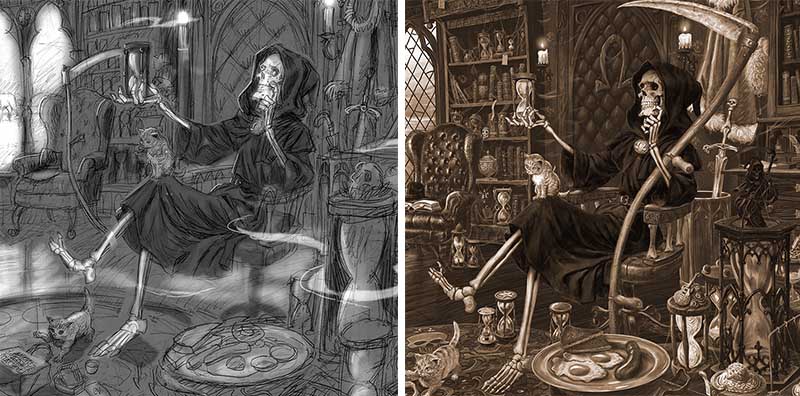
We defy anyone to look this Grim Reaper in the eye socket and not wonder what he’s thinking about. We definitely wanted to keep the skull feeling very natural, not exaggerating his features nor evoking a sense of horror. This was tricky, as it only allowed us to play with angle and lighting to create feeling, but in the end it makes for a very convincing and subtle expression which really ties the whole piece together. And so… In the centre of the image he sits, deep in contemplation, surrounded by those things that make him, ‘HIM’.
As ever, no picture is as good as the one in your mind’s eye, but we’d like to hope that in this instance, we have at least given you a near Death experience.
The completed rendition of Death’s personal hideaway is an image that we hope will capture the Death you all know and love. As a puzzle, it is chocked full of enough hidden references, unexpected treats and snippets of stories to keep any Discworld Disciple or plucky puzzler busy for days. As a print, it is a home inside your home, a scene for you to gaze upon and consider matters of life… and death!
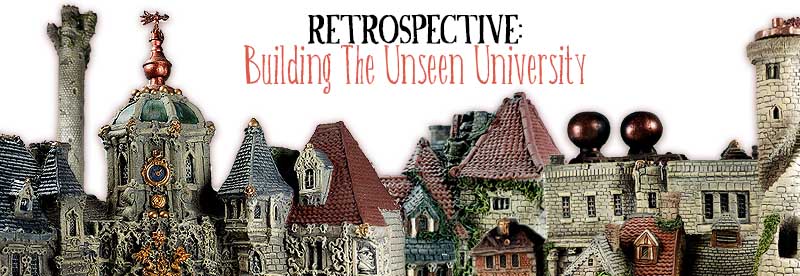
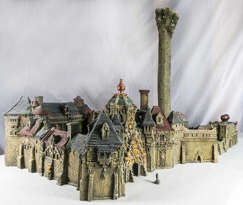
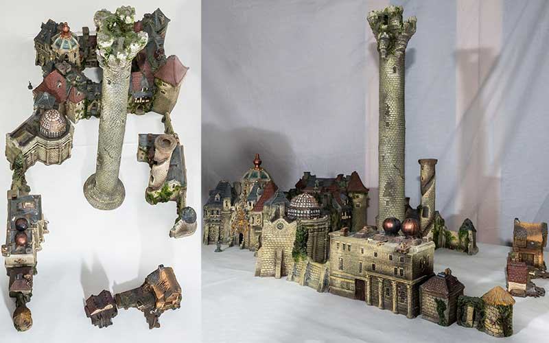
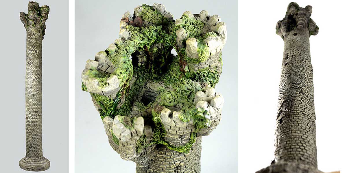
Bernard had already blazed a trail for fantasy sculpture with renditions of dragons and incredible architecture, but ‘The Cunning Artificer’, as Terry Pratchett had named him, decided to reach new heights (certainly as far as the Tower of Art was concerned), with the largest scale model from Terry Pratchett’s Discworld and most complicated piece of Discworld merchandise in the multiverse. Ever. This epic sculpture would create the definitive picture of Unseen University, and would become a paper model nearly ten years later when it was illustrated for the Unseen University Cut-Out book in 2006. Produced in only a short number it is now a rare and sought-after beast. In this blog, Bernard takes us through the creation of the ultimate piece of Unreal Estate, from an idea planted by Terry Pratchett, to the madness and magic of the ‘Unreal’ thing…
“The Unseen University started life on Terry Pratchett’s sitting room carpet. It was Christmas in 1996 and Isobel and I were staying in Broad Chalke with Terry and Lyn. I had been commissioned by an American company to design and sculpt a large imposing fantasy castle for their collection. This castle, the largest piece of fantasy sculpture I had ever undertaken, combined my loves of story-telling and architectural sculpture. The piece was called the ‘Grail Castle’ and was full of detail that led the eye from rocky base through archways of stone up long stairways and on up to domed towers. It was an absolute bugger to cast, and the painting was a challenge as well. I seem to remember something like ten were made to test the mould and trial various paint finishes. It was one of these that Isobel and I took with us from our then home in Suffolk to show Terry in Broad Chalke that Christmas. As Isobel unpacked several large boxes Terry had her arrange the various components on the carpet and then to our surprise he got down on the floor beside it. He looked at it from every angle, above, below and alongside. Getting to his feet he picked it up and put it on a nearby table, again he looked, not saying a word. You can imagine my feelings, Terry was not one to flannel or over enthuse; he told you just what he thought. No wrapping words up with ribbons of flattery or slip-sliding criticism in with bland mutterings. It turned out that he really liked it and it found a place in their home, which I considered a real privilege then as now.
As we sat and worked our way through the biggest collection of spirits outside the Society of Psychic Research or indeed the Licensed Victuallers Association’s private vaults we talked of sealing wax and string, the meaning of life and what would that bottle of funny sticky green stuff taste like. Then Terry suggested I might like to have a go at creating the Unseen University, if I thought I could, if I had the time. I was gobsmacked, pleased, worried and in receipt of the best Christmas present I had ever had. On the back of a serviette with holly on – well it was Christmas – he drew up some ideas he had following a plan described by the esteemed Mr Stephen Briggs in the Discworld Companion. This continued over breakfast the next morning and when eventually we left for the long journey back to Suffolk I had his blessing and encouragement to start designing what would be the most challenging and involved piece of architectural sculpting I would ever do…
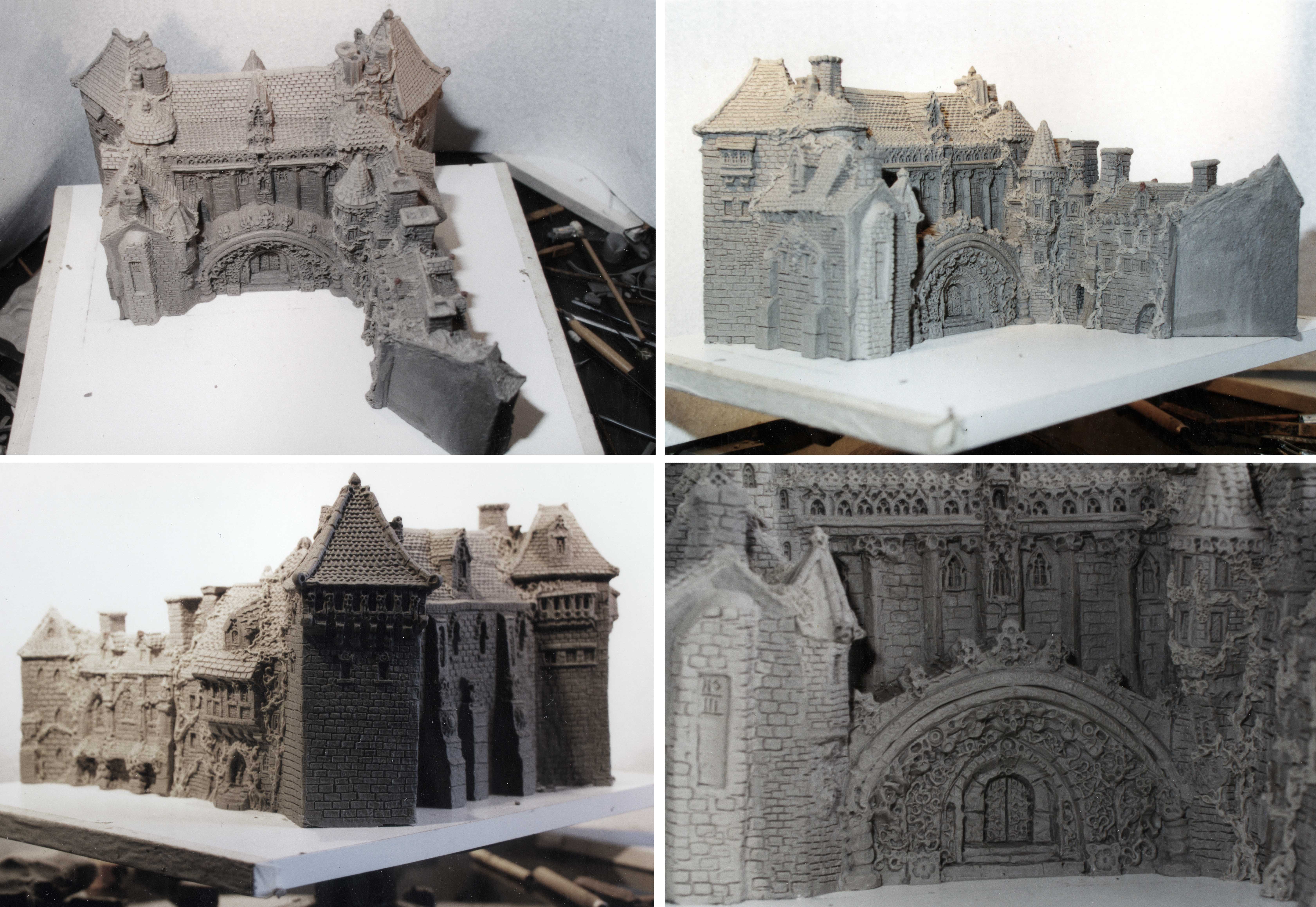
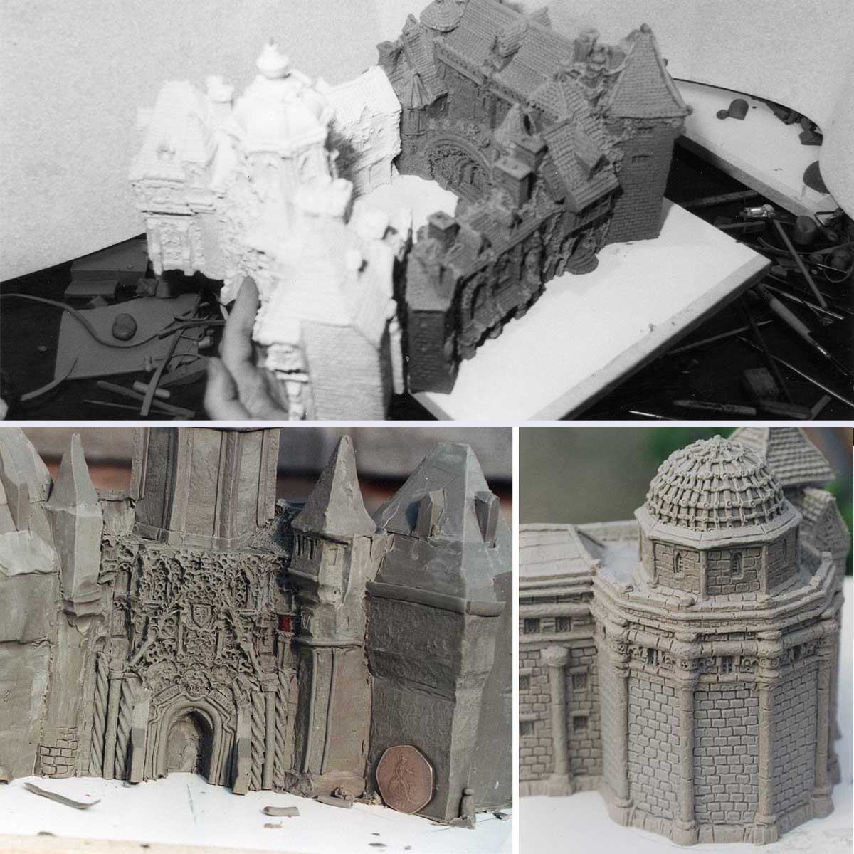
The size of the project meant that each part of Unseen University was produced as a separate unit and, as each section was designed and sculpted, the wax was transported to Terry for his approval. The look of the thing was partly inspired by Brasenose College, Oxford, with a touch of Nuffield perhaps. At Terry’s suggestion I consulted with the venerable Briggsy who not only knew Oxford like the back of his hand but had also drawn the original doorway for the UU. With his description, a pile of architectural reference books and with Brasenose as reasonable starting points, from there on in it was seeing the pictures that Terry drew in my imagination with his words that built the UU. And what clever words they are.
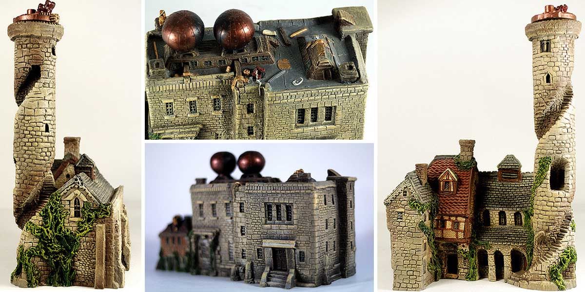
Of course a Watch houses or guild building is one thing, but the creation of Ankh-Morpork’s multidimensional magical university campus presents somewhat unique engineering challenges! With the ‘real’ Tower of Art being a lofty 800ft, it was made plain to me that the Tower would have to be as was practical. If I kept to the scale I normally worked at it would need to be eight foot high to be in proportion with the rest of the building! It couldn’t be that, but even so it had to tower above the rest, so the ancient crumbling tower stands at a still impressive 60cm tall!
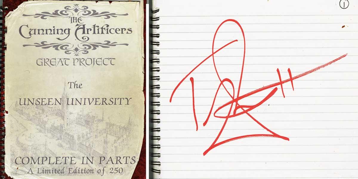
The Unseen University sculpture was launched for pre-sale at a Clarecraft Event in the summer of 1997. It was a hot sunny day and we sat at a small table in an old farm building where I was working on the slightly melting wax model of the Tower of Art and Isobel had a large red book for people to reserve their editions. Terry signed up for Number 1 with a whopping great signature (in red pen no less), and that weekend more than 100 people put their names down. At the time we took no money, only a commitment to buy. Those who subscribed to what later became known as ‘The Cunning Artificer’s Very Friendly Society’ probably still rue the day. Many of our past pieces were created in short editions of 100-200, partly because demand for Discworld-related ephemera was fairly limited back in the days of old-fashioned mail order, but mostly because of the sheer complexity of creating the things… not to mention shipping them! If we were to produce something similar today, it would probably be just as rare.
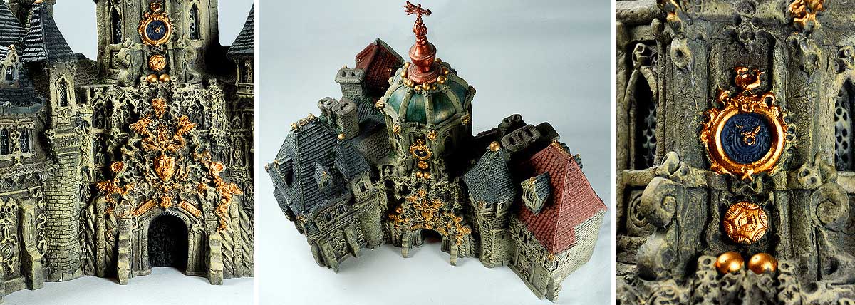
In the end Discworld’s Unseen University took over a year to create. There were seven sections which dove-tailed together to create one of the most remarkable pieces of literary merchandise in fantasy franchise history! The final great edifice comprises the clock tower, Great Hall, Library, High Energy Magic Building (home of Hex), observatory, Tower of Art, various accommodations and service quarters, and the boat house. When laid out according to the accompanying floor-plan, the complete model takes up about a meter square, and weighs almost as much as I do! Each of the seven sections were released to subscribers in instalments, with one master mould-maker to cast and fettle each piece by hand, and one exceptionally patient painter to painstakingly bring each piece of the UU to life with a paintbrush!
If sculpting Rincewind was the beginning for me in making little bits of Discworld then the Unseen University was my coming of age. I went on to create two Watch Houses – Treacle Mine Road and Pseudopolis Yard; Guild buildings including those of the Seamstresses, Assassins, Fools and Thieves; Lancre Castle; Don’tgonearthe Castle; Granny Weatherwax’s Cottage; The Thunderer printing press from The Truth; the Unseen University’s Mighty Organ (a Bloody Stupid Johnson creation) and all manner of ‘stuff’ that had at its heart the words of Terry Pratchett and his books. A craftsman reaches his peak when the skill of his hands matches his imagination. I had the unique privilege to work directly from Terry’s imagination and bring my skills to make just some of his imaginings real enough to touch.
On my desk is a small wooden box; it was made by my father when he was at school. In it are some of the small wooden and metal tools which I carved years ago when I started the Unseen University. These tools created the bricks and mortar, windows and roof tiles of most of the Discworld Buildings I created and they represent the thousands of hours I spent having more fun than a man should when earning a living. Tiny bits of wood and brass, bits of old clock, rubbish to almost everyone but me, but I treasure them as I do the memory of a remarkable man and very close friend who lay on a carpet and had a brilliant idea.”
– BERNARD
With thanks to Steve James AKA Steeljam for allowing us to use his marvellous iconographs!
As decreed by the arbiters of Discworld, 2018 shall forever be known as The Year of The Justifiably Defensive Lobster. And so, with the year of the Backwards Facing Artichoke firmly behind us, it’s time to glance back over our shoulder to reminisce about a year that brought us many celebrations of our favourite author, and what a Terry-fic year it was!
The year began with confirmation that Terry and Neil Gaiman’s apolcalyptic collaboration Good Omens was to become a six-part series for Amazon and the BBC, due to air in 2019. News of Amazon and BBC Studios’ adaptation was tantalisingly teased throughout the year with casting revealed to boast a ‘heavenly’ swathe of acting talent. We can look forward to David Tennant playing Crowley, Michael Sheen as Aziraphale, Josie Long as Agnes Nutter, Jon Hamm as Gabriel, and Jack Whitehall as Newt, with fellow cast members including Adria Arjona, Miranda Richardson, Reece Shearsmith and Anna Maxwell Martin. Filming got underway in the Autumn with executive producers Rob Wilkins and Neil Gaiman providing behind-the-scenes sneak peeks from their via their Twitter feeds @TerryandRob and @NeilHimself.
In Febuary Terry was brought back by Charlie Russell and the BBC in a unique and tear-jerking exploration into the life and times of our favourite author. Terry Pratchett: Back in Black, was ‘the fourth instalment in the Terry Pratchett documentary trilogy’ and was a unique farewell presented by Terry himself through the uncannily accurate acting skills of Paul Kaye and with poignant unseen footage recorded with Terry prior to his walk with Death.
Terry also became the star of his own exhibition when Terry Pratchett: Hisworld opened at Salisbury Museum in September. Curated by finds officer Richard Henry, aided and abetted by Rob Wilkins, Paul Kidby, Rhianna Pratchett and the estate of Terry Pratchett to mention but a few, this powerful literary exhibit was a triumph of A’Tuin-like proportions. Terry’s self-depreciating nature, creativity, sense of fun and love of learning shone brightly as the author himself guided visitors around the exhibits in his own words via quotes gleaned from the may interviews, writings and recordings he made over the years.
Expertly, sensitively and humorously curated, Hisworld was truly the highlight of our year living and breathing Discworld – hat a celebration of the man in the Hat! Closes Sunday January 14th.
2017 also saw a flurry of Pratchett publications with host of special editions and new titles. The Tiffany Aching series enjoyed two new style treatments, with the release of the gorgeous Paul Kidby-embellished Gift Edition hardbacks and bright new paperbacks illustrated by Laura Ellen Anderson. Raising Steam finally became available for collectors of the black cover paperbacks, and a re-release of The Illustrated Eric united Josh Kidby and Pratchett’s imaginations on the page once again. The Discworld Collector’s Library hardbacks were brought closer to completion with the publication of Thief of Time, Night Watch, Monstrous Regiment and Going Postal, our bestselling books of the year!
Father Christmas’s Fake Beard, a festive collection of short stories from Terry’s time as a newspaper journalist, was unleashed in two glorious hardback editions in October, while The Discworld Imaginarium, Paul Kidby’s epic compendium of illustration and artistry provided a fitting finale to a year of Terry with the entire cast of Discworld brought to life with nib and brush in one spectacular coffee-table tome.
Of course, books are at the heart of the Discworld Emporium and we have been overwhelmed by your support in choosing to purchase Terrys work from us. While it’s hard for a small booksellers to compete with larger retailers, we are so very lucky humbled to have such a loyal booklovers amongst our customers. You can be sure that we’ll continue to ensure that every book is picked and packaged with care and reverance!
Some of our favourite Discworld Stamps emerged in the year of the Backwards Facing Artichoke (of course we may be a smidge biased). Our chief designer Ian spearheaded a wide variety of designs celebrating a variety of locations and concepts from around the Disc, with collaborations from with Pratchett book illustrators & Emporium guest artists David Wyatt and Peter Dennis. The year kicked off with the traditional annual launch of the Ankh-Morpork Definitives, those iconic stamps created by Moist Von Lipwig in the pages of Going Postal comprising the Halfpenny Post Office, Penny Patrician, 2p Coat of Arms, 5 and 10p Morporkias, $1 Tower of Art and 50p Cabbage Field. There followed (in no particular order) issues from the Seamstresses’ and Thieves’ Guilds, from Klatch, Big Cabbage, Octarine Grass Country, Fourecks (XXXX), and from the the Agatean Empire with a stunning 2 Rhinu stamp featuring The Last Emperor Ghengiz Cohen.

Special super-limited releases for 2017 included the Fools’ Guild Hall of Faces sheet, Discworld Stamps 13th Birthday minisheet, the spectacular Unseen University Octogram, and of course our Hogswatch issues featuring the Hogfather and his porcine-powered sleigh. We also released 12 editions of our Little Brown Envelope, a traditional ‘lucky dip’ assortment of Discworld Stamps, each themed to introduce news issues.
To find out more about Diswcworld Stamps and learn how Going Postal began a philatelic phenomenon visit our History of Discworld Stamps!
Other Discworld merchandise releases from the Emporium included our Death of Rats and Librarian figurines, beermats from the mended Drum & fellow Discworld drinking dens, Turtle Moves Bumper Sticker and Death (with cat) Discworld plush – the Grim Reaper has never been so cuddly!
2017’s apparel collection introduced the wonderfully naughty Hedgehog Song Book Bag, and our Death of Rats and ‘I Could Murder A Curry’ T-Shirts which feature original artwork created exclusively for us by Joe Mclaren – the man behind the Discworld Collector’s Library Edition book covers. The bestselling addition to our clothing range was undoubtedly our Discworld socks featuring A’Tuin, L-Space and Death motifs – Polly Perks would be proud!
The Emporium also collaborated with Joe to create a fabulous set of Discworld Greeting Cards with designs including Dibbler, the Lancre Witches, Death & Death of Rats, the Hogfather, Librarian and Errol the swamp dragon!

Our most ambitious project of the year was our depiction of the Great Library at Unseen University for our latest Discworld Jigsaw puzzle and spectacular art print. Having fallen in love with the Librarian all over again during the creation of our figurine, we teamed up with David Wyatt to bring the UU’s multidimensional book haven to life, which you can read about in our previous blog post HERE.
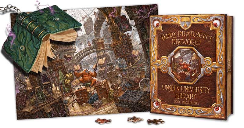
2017 was our busiest year for online orders and visitors to our ‘real’ shop (or should that be ‘unreal’). We shipped books and Discworld goodies to Pratchett fans in previously uncharted territories including Chile, Peru, Serbia, Malta, Hawaii, South Korea, HongKong, Dubai and Qatar. It was also a bumper year for Discworld conventions, with the North American, Australian, Irish and German Discworld conventions providing international celebrations of all things Terry Pratchett. Our bonkersly busy year meant that we were unable to take our travelling shop on the road to peddle our wares, but we were able to partake via video link and recorded message and Emporium founders Bernard and Isobel Pearson flew to Cork to enjoy IDWCon as guests of honour. We look forware to making up for our absence this August at the Uk Discworld Convention in Warwick.
And so, as we hurtle full steam into the Year of the Justifiably Defensive Lobster, we would like to thank you for your kind custom and support throughout 2017 and for helping us to keep the turtle moving – you really are the best customers a little literary shop could ask for! We are especially grateful to those who braved the milage to make the Pratchett Pilgrimmage to the Emporium itself. The Hisworld exhibition in Salisbury has brought many fresh faces to Wincanton and introduced us to many new Discworld devotees with wonderful anecdotes and tales of the the man in the hat to treasure. We hope to meet many more of you in the year ahead.
Here’s wishing you all the best & many happy Pratchett reads for 2018, may The Lady smile upon us all!
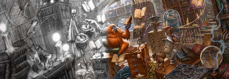
Is there any finer feeling for a bibliophile than being in the company of books? Each one of you will know the giddy thrill of picking up a new tome – the lovely warm ‘thunk’ when you tap it, running your fingers across virgin sheets of freshly printed words, flipping the pages and having a cheeky sniff when you think no one is watching. What could possibly mean more to a reading addict than a book? A Library, of course! A temple for the worship of words.
For us, the Great Library of Unseen University on the Discworld is, quite literally, the most magical literary institution of them all, containing the highest concentration of ‘bookishness’ anywhere in the multiverse! We wanted to pay artistic tribute to this astonishing establishment by devising an image to make every book-lover go weak at the knees, a view of this monumentally impossible place that would draw you in for a moment and make you want to stay forever.
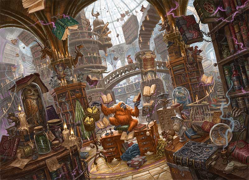
“The Library certainly wasn’t silent. There was the occasional zip and sizzle of a magical discharge, and an octarine spark would flash from shelf to shelf. Chains clinked, faintly. And, of course, there was the faint rustle of thousands of pages in their leather-bound prisons.
– Terry Pratchett, Equal Rites.
Capturing Terry Pratchett’s infinite, multi-dimensional, thaumically-charged library was no mean feat. As always, we started by re-reading our extensive file of notes on the novels, piecing together all the snippets of material from which we could construct a truly fantastical image true to the books. As Discworld fanatics, you’ll all know how well Terry Pratchett described Unseen University, so we’ll skip right ahead to the design and sketching process…
Firstly, we had to decide a time and a place for the image. We might have plumped for a magical, twinkling night time scene, with starlight lancing down from the dusty glass dome high above, or we could have gone for a mind-melting maze reminiscent of MC Escher. In the end we decided we wanted a light airy view from the entrance of the library – a welcoming sight for any aspiring wizard, full of grandeur and literary possibilities with just a hint of potential for thaumic catastrophe.
The composition of the image had a LOT of work to do. Not only did it have to look jolly nice, but it had to create the illusion of a HUGE space, draw the viewer in to explore the image, and support the twisted perspective of L-space. If the framework of a picture feels ‘real’, then the fantastical elements will be a lot more convincing and immersive. To give the viewer a sense of truly being there, the library was drawn from a head-height perspective, thus allowing the viewer to explore the library from the point of view of a bona-fide wizard! This beautifully simple viewpoint allows the beholder to look ‘up’ in wonder at the dome and down onto the floor as it stretches away beneath the feet, giving the sense of feeling the ancient flagstones, or being able reach out and grab a book from the shelves.
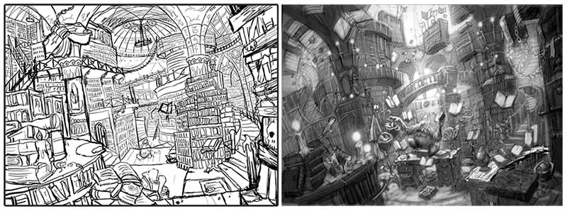
Imagine standing in a cathedral, with its aisles and rows of arches, columns and pointy-topped windows… the internal architecture deliberately draws your eyes to behold the impressive space before you. If such divine design is good enough for the house of god, we thought we’d nick a bit of it for fiction’s greatest library! Strong perpendicular lines, sweeping arches and columns in the mid-ground provide vertical structure for the whole image, leading the eyes upwards and suggesting the colossal mass of the building. The curves in the distant dome extenuate these leading lines to create a pleasing contrast in shape toward the center of the image, and are reflected in the bridge and flooring. To make the environment more ‘unreal’ we skewed the image for a dizzying effect and drew in multiple meandering paths into the image; stairways spiraling out of control, walkways, bridges…. all adding to the sense of indefinable space and depth. With a strong a framework of reality we could apply the fantasy and populate the piece…
If the framework of the illustration sets the scene, then the details tell the story. We began to find homes for some of our favourite details from the novels, from Wow-Wow sauce to the Verruca Gnome, from the shopping carts that appear in Reaper Man to The Globe from the Science of Discworld series, you’ll find them all dotted around the library. A lot of Pratchett’s descriptions of the library are visual, but the sounds and smells are equally important. As we began to map out details, we made sure that there were plenty of sources to stimulate the senses in the imagination. A gently smoldering tobacco pipe, guttering candles, and a gently rotting pile of bananana skins all suggest the unique bouquet of Unseen University, while the crackle of octarine sparks, clinking of chains, rustling of pages and footsteps on flagstones gently break the academic silence. Using exaggerated textures we hoped to convey the feeling of running your fingers over leather-bound books and ancient polished wood. All of these sensory cues were designed to put you, dear reader, in the picture.
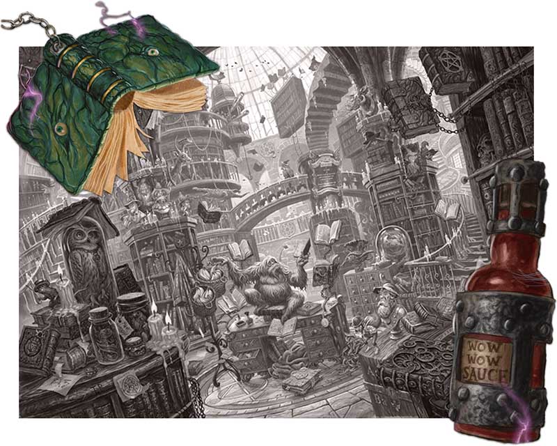
At this point we’d nailed down the design of the illustration, and yet we’d barely started. After a series of compositional drawings and draft sketches we soon realised that if we ever wished to see project completed we’d need a little help. So, we enlisted the aid of one of our associate artists, the fabulous David Wyatt, to bring the image to life. David has illustrated Pratchett covers for the Amazing Maurice, The Carpet People and Bromeliad trilogy, along with numerous Discworld calendars over the years not to mention book covers for the likes of J.R.R. Tolkien, Jasper Fforde, Philip Pullman and more recently Kieren Larwood’s The Five Realms series. David really was the only choice for the job, having worked with the Emporium for over a decade on various projects and knowing Discworld well enough to tackle such a complex image with the care and attention to detail required. Most importantly he was daft enough to say yes!
“I first visited Discworld (illustratively speaking) back in 2001 when I designed the cover of The Amazing Maurice and his Educated Rodents. At the time, Terry’s children’s books were released by a different publisher than those of the Discworld novels, although I believe Maurice was the first crossover. Immediately after that I re-covered a number of his earlier works. There followed an avalanche of commissions for assorted Discworld quiz books, calendar images, craft beer labels and even stamps (which led to a long association with the fine folks at the Discworld Emporium).
A selection of David’s Discworld book covers and artworks, including the Unseen University Library as illustrated for Discworld Stamps!
As I had painted the Librarian several times before, I knew what I was getting myself into in trying to depict his place of work. The biggest challenge was dealing with the warped architecture and creating a sense of depth whilst cramming as much detail in as possible to make the puzzle interesting. It was a little overwhelming to paint as a whole, so I concentrated on specific areas at first, moving them around until everything started to sit right. This was achieved by scanning in pencil drawings and fleshing them out in Photoshop/Painter. It’s not unusual for me to produce a tonal study of an illustration (if I get that right then the colouring is usually a piece of cake) but never one this finished; on this occasion it was important that all the little details were clear as everything needed to be approved at the highest level. It also made sense to get a feel of how the image would translate into jigsaw pieces at the printed size (I don’t do such enormous pictures normally!)” – David Wyatt.
As David worked from Ian’s sketches, the image began to come to life in the most extraordinary way. Sketched and completed in sections, piece by piece UU’s Great Library was coaxed into existence. The piece went back and forth between designer and illustrator to get the depiction ‘just right’, morphing from grey pencil, to black and then to sepia before being give a full colour treatment. The palette we chose to colour the image is full of jewel tones; emerald greens, ruby reds,golds, and bronzes and rich mahogany wood hues to reflect the sumptuous surroundings of the wizards’ world, while highlights of smoke dust and octarine sparks convey a spirit of magic and mayhem.
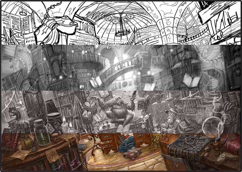
The Emporium has a tradition of creating ambitious detailed visions of the Disc, from the meticulous architectural models of Bernard Pearson’s Unreal Estate, to the cartographic wonders of the Compleat Ankh-Morpork and Discworld Atlas… if the devil is in the detail then devilish we are! We love telling stories with our depictions of Terry Pratchett’s world, and this piece is no exception being one of our most ambitious illustrative projects yet. A real labour of love, after the research and design process it took a total of twelve weeks’ work to produce the final image. Never before has the Great Library of Unseen University been seen in such detail, and we take great pride in being able to lay before you our vision of this puzzling place in Glorious Thaumicolour!
From the outset, we knew that the library in all its fantastic detail was destined to become the second of our Fiendishly Difficult Discworld Jigsaw Puzzles. A puzzle as intricate as this is an illustrator’s nightmare, because every single centimeter of your work is literally broken down into pieces and scrutinised at close range… and by rabid Pratchett fans at that! We were, of course, entirely unafraid by this challenge (largely due to it being David Wyatt’s problem now) and because we’re so proud of this piece, we thought we’d push the boat out on presentation too. If you wish to own this image in jigsaw form, you will find it arrives in a fabulous spell book box designed by Ian and David – after all, what could be a more appropriate vessel for an Unseen University Jigsaw Puzzle than a spell book?! It’s probably the only puzzle you’ll want to keep on your bookshelf, looking as it does, like a magical tome from those hallowed shelves of Unseen University. If time, inclination or attention-span preclude such puzzling activities, you’ll be relieved to know that this work of art and magic is also available as a sumptuous print produced on silk-finish archival paper to decorate your own libraries and reading rooms!
We hope you enjoy exploring Unseen University’s Great Library, the first of our elaborate scenic escapes into Terry Pratchett’s Discworld . . .
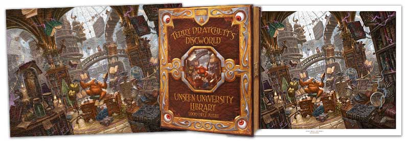
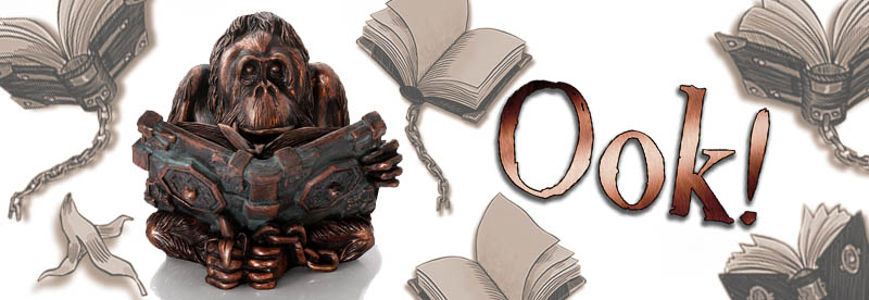
The Librarian is a complex being. Sage and sweet when curled up with a book and blanket under his desk, yet likely to go ‘Librarian poo’ at the mention of the ‘M’ word’ or any student who fails to return their books in a timely fashion. He is as likely to tenderly dust an ancient magical tome as he is to hurl a grown man in a bar fight at the Mended Drum.
While he speaks only using varied inflections of ‘Ook’ the Librarian is often, and somewhat ironically, the ‘voice’ of reason when the midden hits the windmill on Discworld. He is a key protagonist in ensuring the right action is taken when needed, despite his associates at Unseen University!
The Librarian is also variously a member of the Ankh-Morpork City Watch, keyboardist for The Band With Rocks In and UU organist and goal keeper, not to mention Best Man at the wedding of Verence and Magrat in Lords and Ladies… capturing this multi-faceted great ape would prove a challenge, but thankfully it didn’t send us bananas!
Some years ago, Emporium MD and designer Ian Mitchell visited Monkey World in Dorset, armed with sculpting tools and a lump of wax with the intention of capturing a likeness for a possible Librarian piece. A female orang-utan sat down behind the glass of the enclosure and copied his sculpting motions with a twig. Although the project was put on the back burner to focus on our book projects with Terry, the experience provided an unforgettable insight into the nature and appearance of our hominid friends, and fuelled our desire to create a ‘real’ orang-utan.
We were delighted that Rich Kingston of Young Rascal Design once again stepped on board to realise our vision, and to continue our range of Discworld figurines in his style. The result is a handsome hominid sitting deep in thought, a banana grasped in his foot, and a hefty magical tome draped with a banana skin marker nestled in his lap. The placement of the hand around his chin suggests we could be witnessing a great mind in the midst of solving a world-threatening conundrum, while it’s easy to imagine him nestled underneath his desk in the UU surrounded by books.
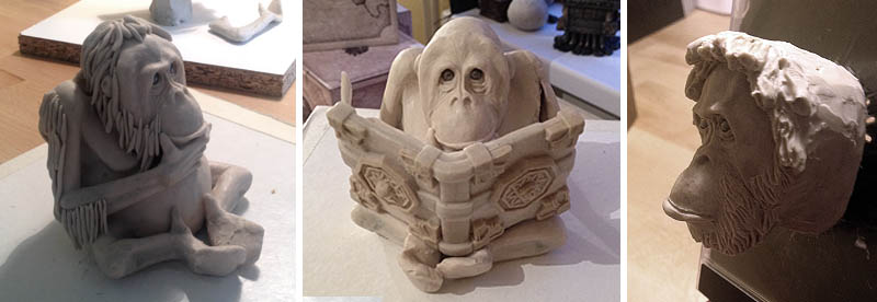
Plotting out the hair, positioning the book, and perfecting the face.
“Plop” as if by magic, another Emporium sculpture brief appeared in my inbox. I took a deep breath and opened the PDF. The Librarian? Right. Um . . . where do you begin with a once human who was turned into an orang-utan by a magical accident? His face. Always start with the face. A few hours of smudging and smearing around a couple of ball bearings for eyes and his presence was felt. That wise, knowing look glared back at me from the back of an old CD case. It felt like I was on to something. This should be easy!
Little did I know that the Librarian would be the most complex and testing piece of sculpture that I had undertaken to date. My previous sculpture of The Death of Rats flowed gothic -like, while the Luggage grinned at you with his many curves and angles. So how could I combine the styles to keep things fluid and make him look authentic? It took many attempts to get his pose correct (moving lumps of wax for limbs to various positions), but when the bulked rough of a book was placed between his feet, everything fell into place.
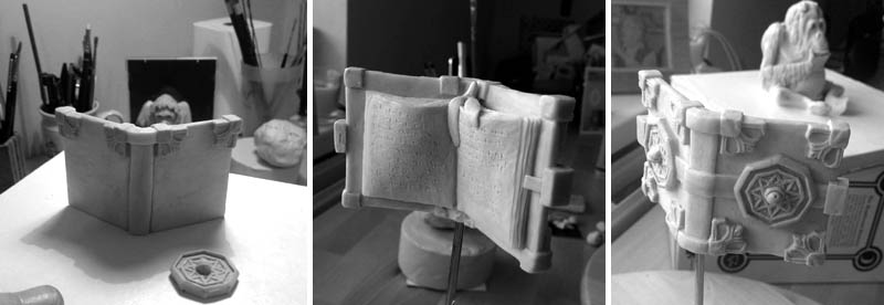
The book was especially tricky. Sculpting something that intricate and small with fingers the size of a large portion of Dibbler’s sausages was a tough one, but I managed it, and gently placed it in the correct position – accompanied with a couple of pages of copy for good measure – ready for his arms and feet to be sculpted and attached to it. Then came his hair. Long strands of individual hair, hanging off his inner-tube arms and orange sized body. Add some fingers, toes, banana and a chain, a few wrinkles, give everything a final smooth down with lighter fluid and there he was, Ooking at me.
As I said, this piece took some serious doing. But it is without doubt, one of my all time favourites. The way his hand holds his chin while those dark old eyes stare at you, just makes it for me. You can almost hear him thinking. And, if you look really closely, a sculptor’s name is just and just eligible on a page of the book. Thankfully, it isn’t involved with anything too heavily spell related, as I can still type while in the form of a newt.”
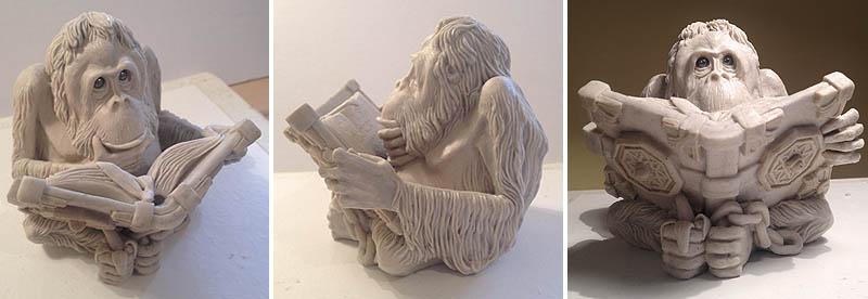 The finished wax sculpture, ready to go under rubber at our casting house.
Casting is as much an art as sculpting. Far from slopping resin into a mould, casting determines the final look of the piece from the inside out, and requires specialist skills to determine a high finish. Mould-making is such a skilled job that a piece is often sculpted with the sanity of the poor bugger who has to free the cast item from the mould in mind. Fortunately we place our work in the hands of the finest casters in the UK who will tackle the trickiest of shapes so that the form of our pieces can be just as we want without too much compromise.
Our first prototype was cast in our signature bronze finish, and while rather lovely the Librarian wasn’t quite… alive. Knowing our caster to have a talent for finishes Ian cleverly suggested that we try copper instead, and the result is the dog’s doodahs – a beautiful glowing effect that evokes the auburn tones of luxurious orangutan hair.
After our second prototype, we decided that the spell book should have its own distinct finish. After all, books are at the heart of the university and characters in their own right. A hand-painted verdigris finish (as featured on our Great A’Tuin figurine) lifts the book’s ornate embellishments, enhances its status and hints at the magic within its pages.
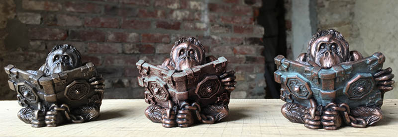
Three wise m- er, apes! Our protoype Librarians: L to R: bronze, copper & final version with patina (the finish, not the goddess).
As with all our precious metal-finish pieces, the Librarian is produced with LOT of real metal and the very best quality durable resin with a layering of pure copper in the mould to coat the work in glorious shiny copper. Each piece is then antiqued by hand, and the book hand painted with a beautiful patina effect.
The Librarian sits beautifully in the palm of the hand and we hope you’ll agree that the he will look right at home watching over your bookshelf – the ultimate guardian for your Terry Pratchett collection!